DIY Brand Kit.

Don't stare at a blank Canva template ever again.

Know exactly how your designs should look and feel to create a consistent visual experience that sells.

Here's the thing.

Consistency isn’t just how many times a week you post.

It’s also how those posts look and feel like.

It’s how the social media profiles, landing pages, websites, email newsletters, freebies… (those posts should lead to) look and feel like.

Picture this:

You’re interested in what someone has to offer, and…

You go from one of their posts 

👇 

To their social media profile

👇 

To their website

… 

But each step of the way, they surprise you with a new vibe, look and feel. What ends up happening?

Your trust level goes down 📉 and your skepticism barometer goes crazy 🌪️

Don’t let it happen with you ⤵️

You can not let poor branding cost you clients and sales.

To create a consistent, cohesive brand experience that gets more people to contact you, you need to know:


🎨 What colors represent you. 

💻 What fonts match your voice and personality. 

📸 How to get photos of you that grab attention. 


And how to use all this in every touch point between you and your audience.


That’s exactly what The DIY Brand Kit will help you start working on.

Does this sound familiar?

🤨
You’ve tried an infinite amount of Canva templates but none of them felt quite right.
🫣
Every time you need to design anything you don’t know what colors or fonts to use.
😬
Your posts, landing pages, and website all look and feel different.
😅
“It looks good enough” is what you often say to yourself while designing.
🫠
Copying others seemed like a good idea but nothing ever feels like “you.”

That’s exactly why I’ve created The DIY Brand Kit ⤵️

Take the first step into the brand identity your business deserves.

⚠️ Nothing will ever replace working with a designer, but The DIY Brand Kit will help you start thinking like one ⤵️

🎨 Know what colors, fonts, and photos to use (and why).

📱 Revamp your social media profiles and content with personality-infused visuals.

💙 Emotionally connect with your audience with a visual identity that shows YOU.

You can’t just pick some random colors you like and fonts that “look good”, no.
We both know you’ve tried that. It didn’t work 😬

So, with The DIY Brand Kit I’m going to show you two quick, and highly effective brand strategy exercises that I use in my Brand DNA process with my Branded to Life clients to help you start making purposeful design and branding decisions.

This is how you'll take the first step to the brand identity you need ⤵️

With easy, and quick to follow exercises. 

The DIY Brand Kit is built on Notion and walks you through the 4 core parts of a brand’s visual identity (and how to use them):

🎨

Color palette that sets the vibe and emotions you want your audience to feel.

💻

Typography that shows your voice and personality.

✏️

Word-mark logo that looks better than any Canva template.

📸

Photography that you’ll confidently shoot yourself.

With these 4 core parts of your brand’s visual identity you’ll be able to design what your business needs in a cohesive manner. Creating the consistent brand experience you need to get more people to contact you.

Get The DIY Brand Kit to design a consistent visual experience that gets you more sales.

After you get The DIY Brand Kit, you will:


🎨 Never stare at a blank Canva template ever again.

😎 Confidently design what your business needs.

✏️ Create a consistent and cohesive visual experience.

💙 Emotionally connect with your audience.

💪 Build more trust with your online presence.
For only 18€* or USD $20*
* VAT fees may apply.

Questions I know you have 🙋‍♂️

Short answer yes. Ideally you’d have an experienced professional designer working with you. But until you’re not ready to work with a good one, I suggest you steer away from any second-grade options.
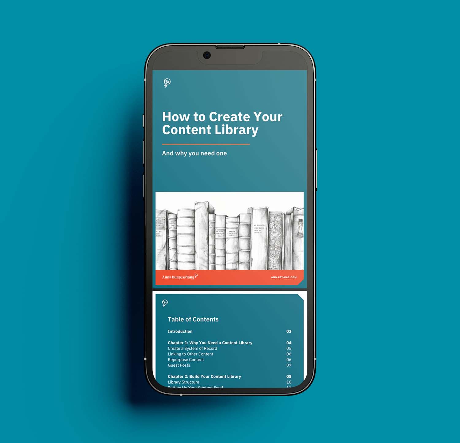
Starting every design from scratch, every time is going to cost you a lot more time in the long run. Plus, I’ve created this dashboard to be easy and quick to go through.
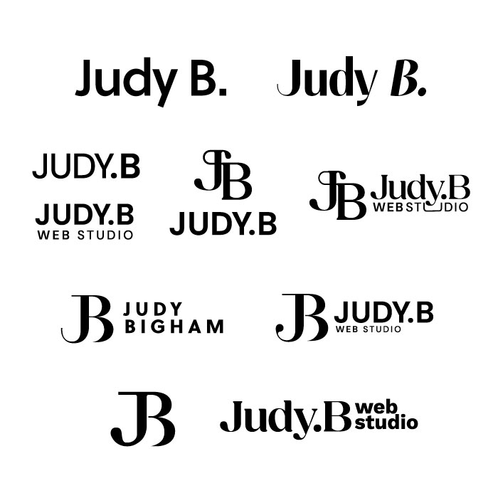
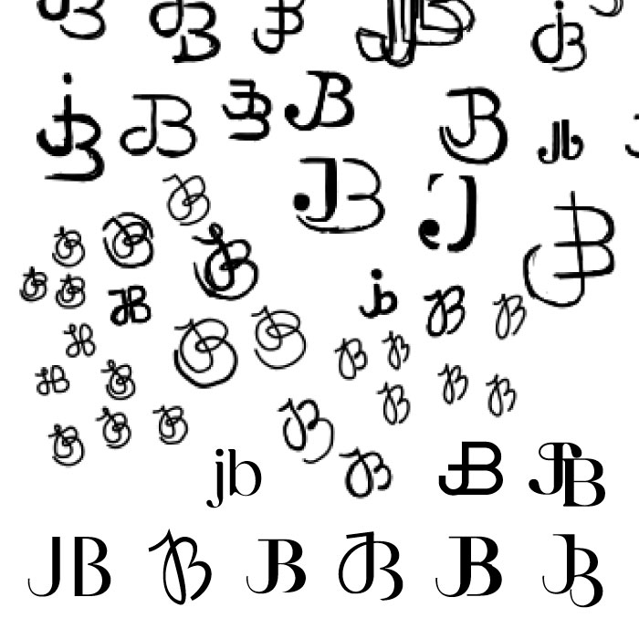
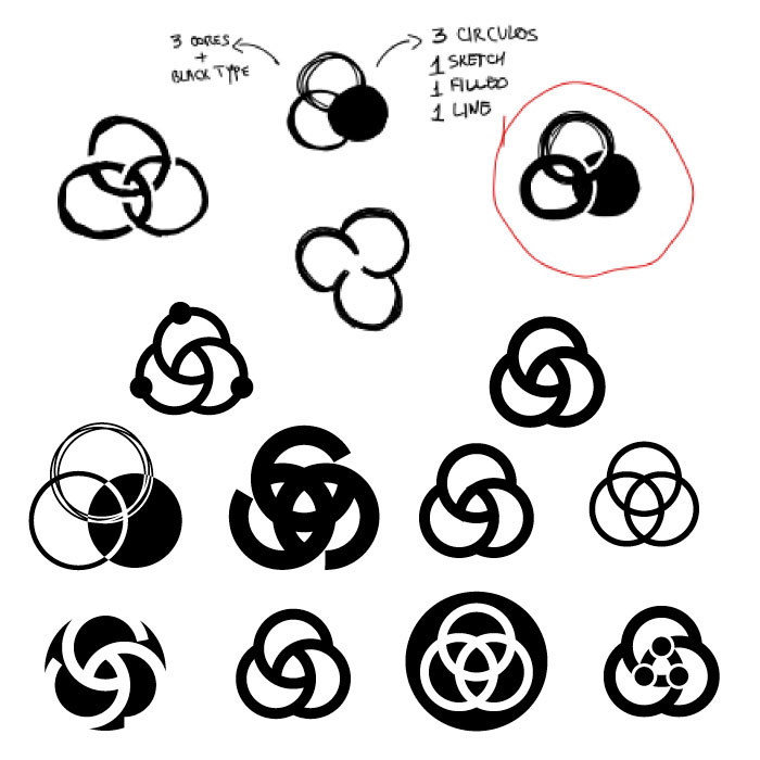
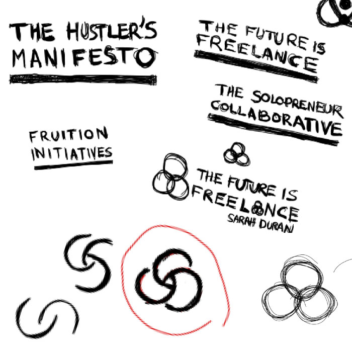
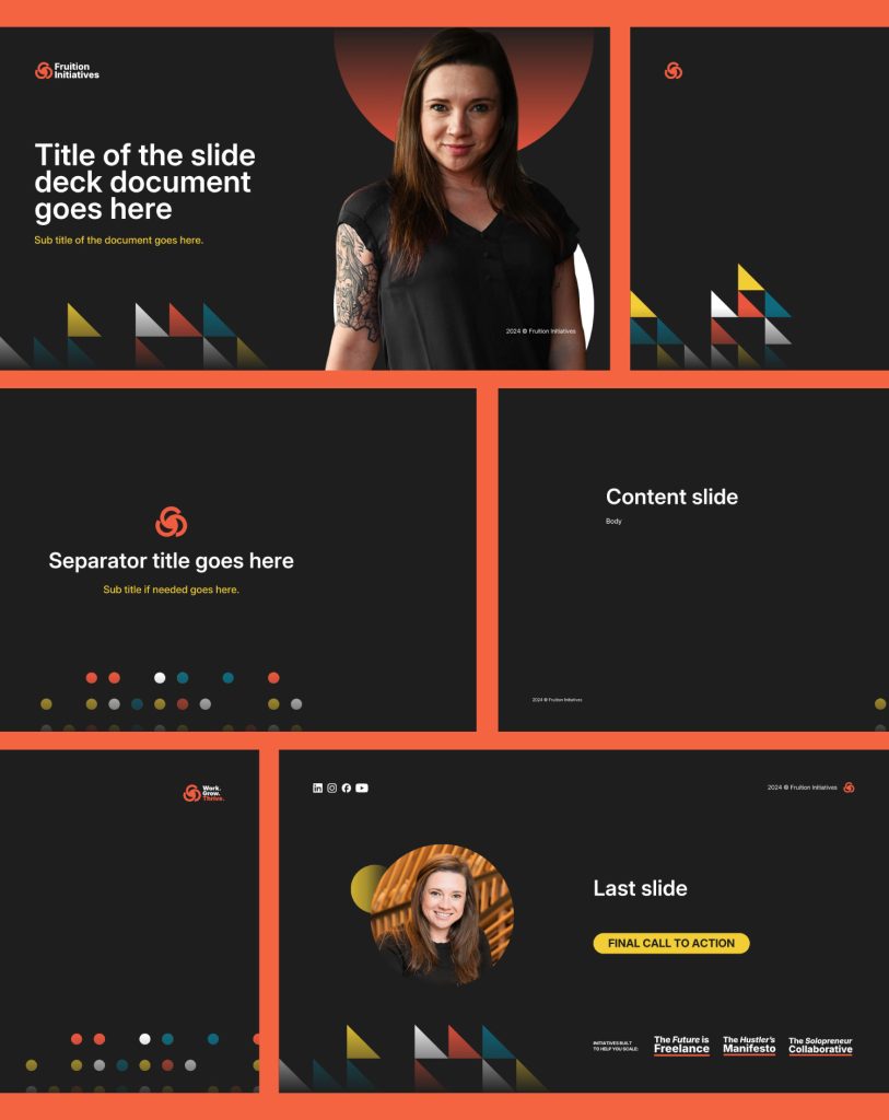
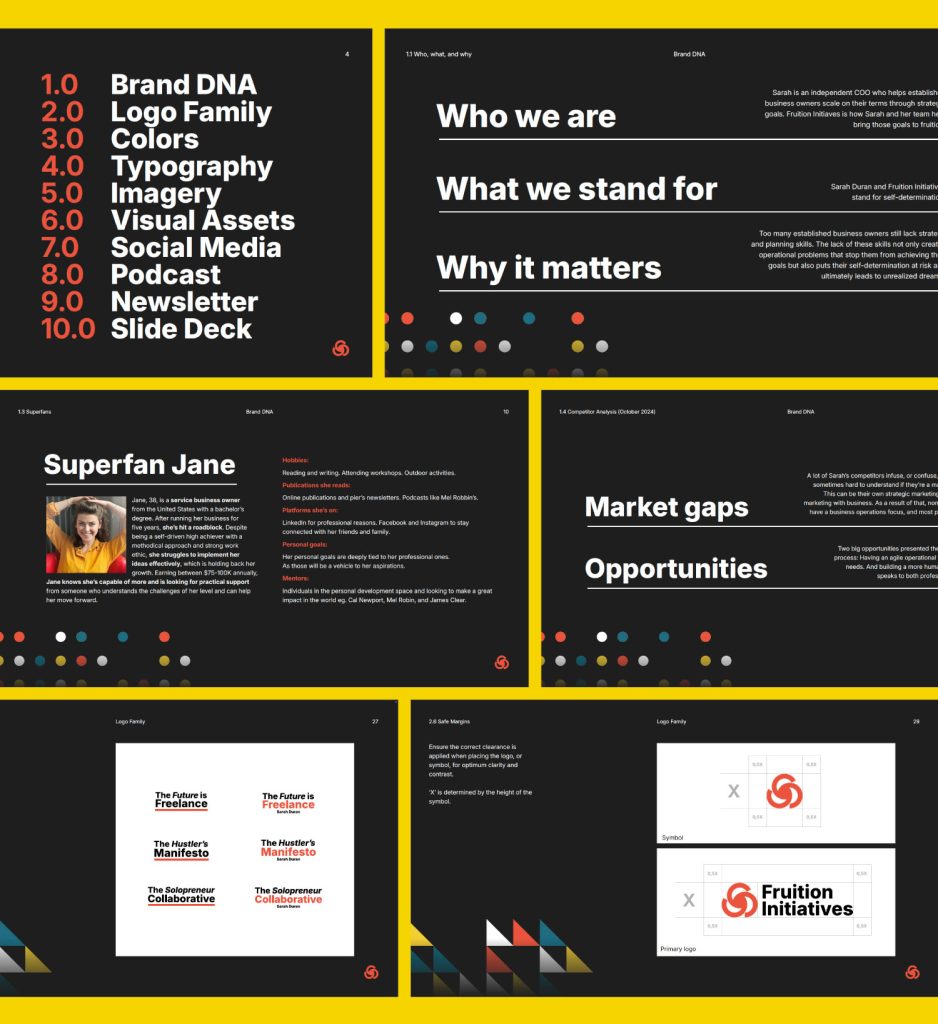
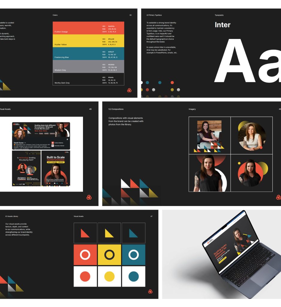
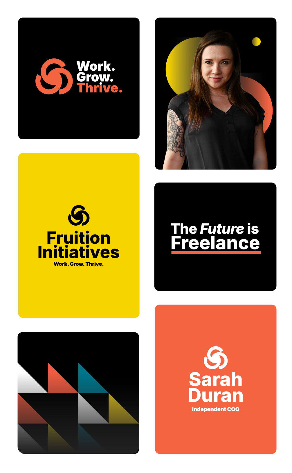
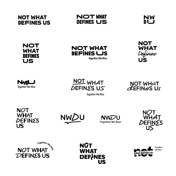
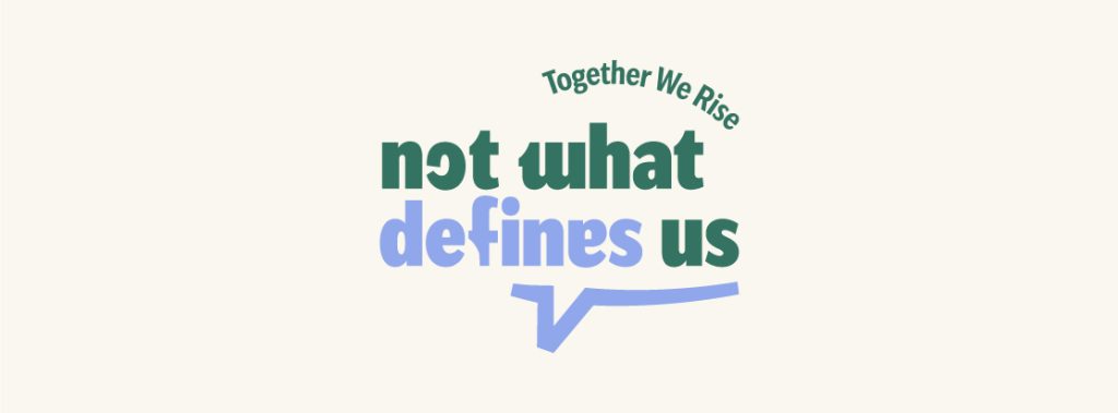
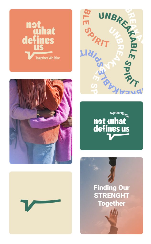
My approach to branding is through informed decisions. That’s why I’m walking you through 2 of my Brand DNA process exercises so you know how to make these choices.
Yes. You don’t need to know anything about design, you need to know yourself and your business. Everything else, I’ll show you throughout the exercises.
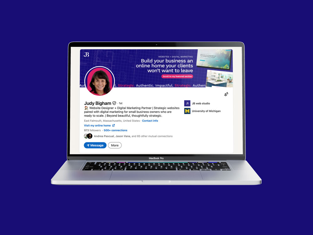
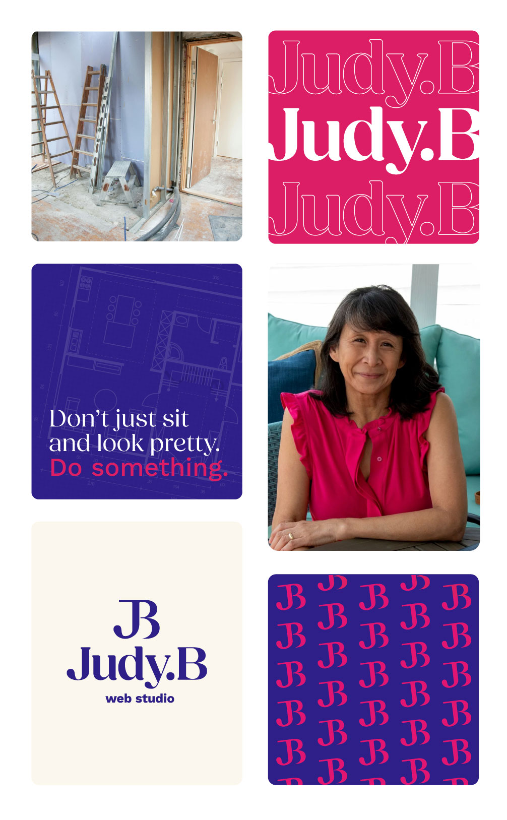
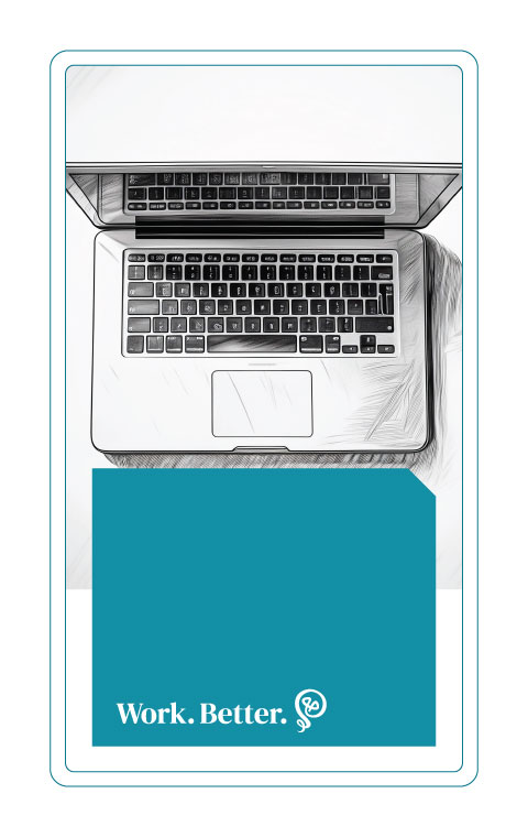
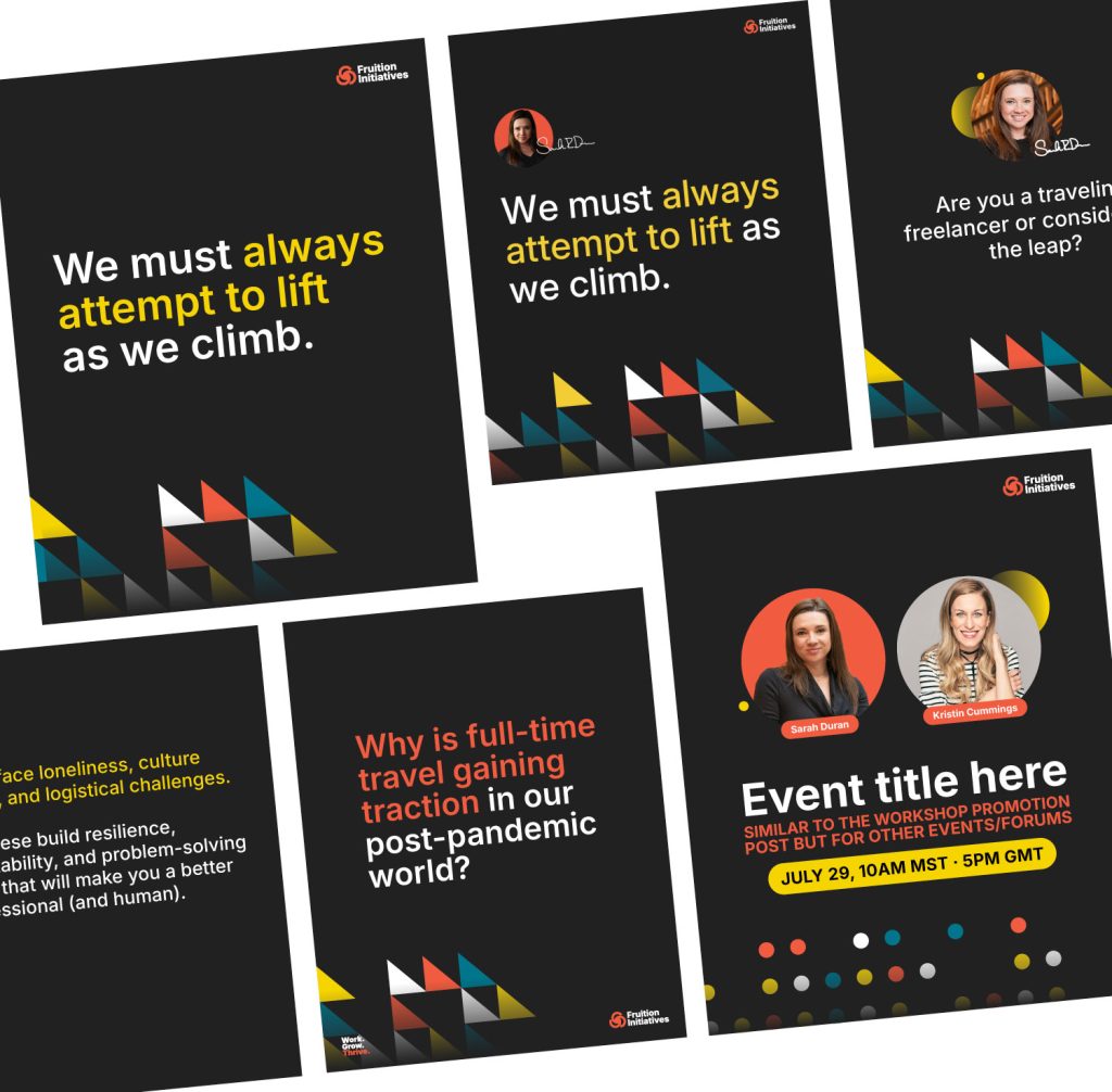
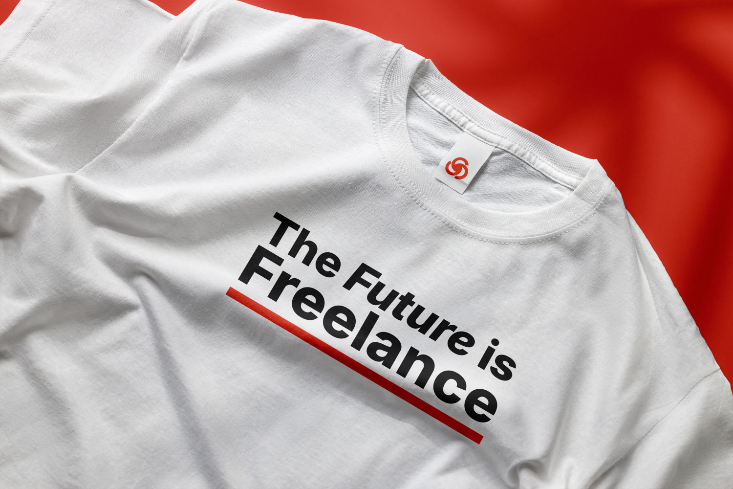
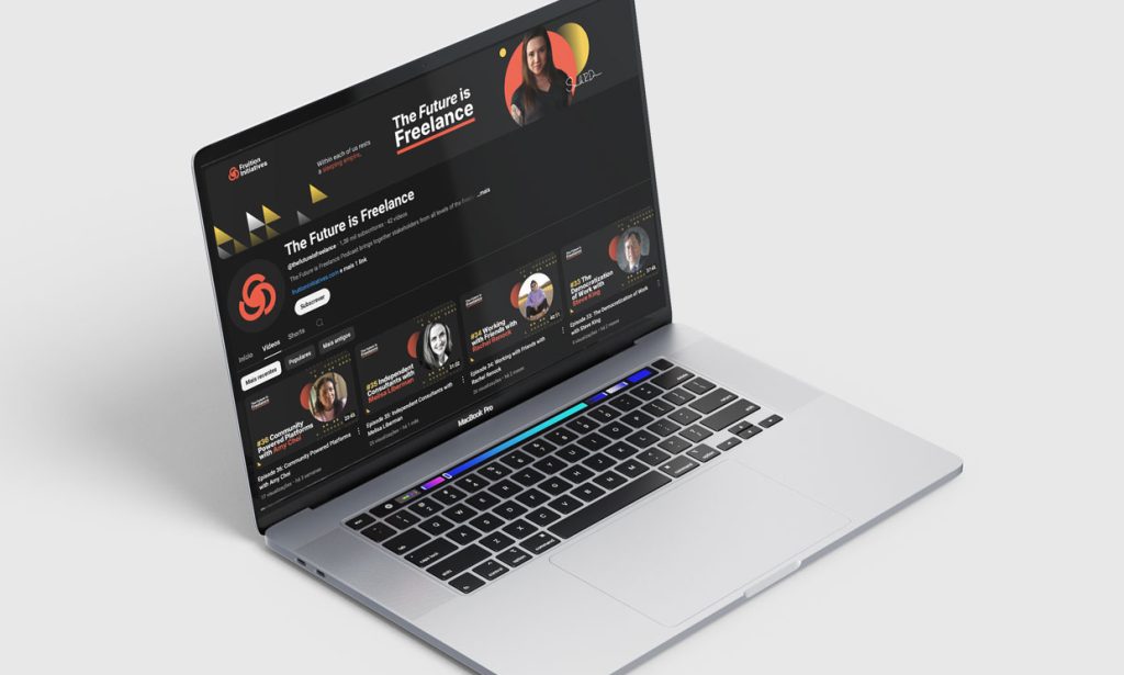
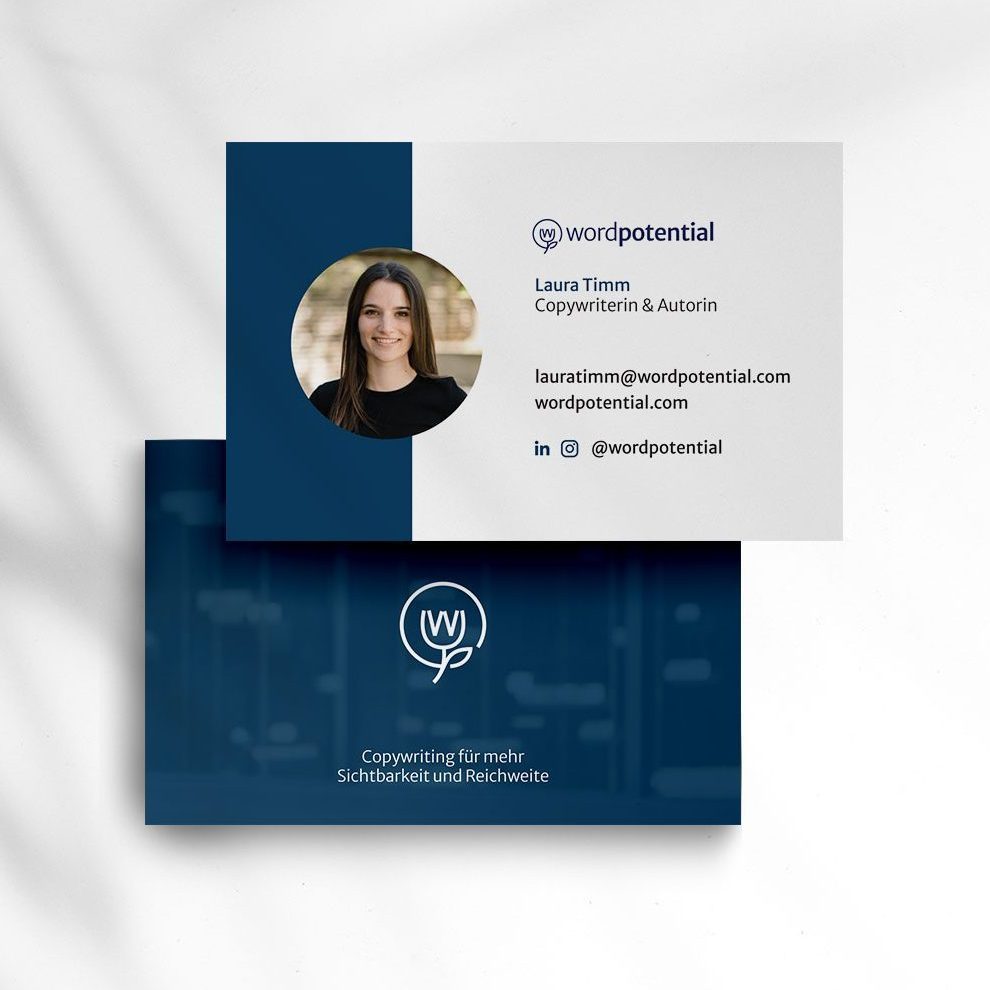
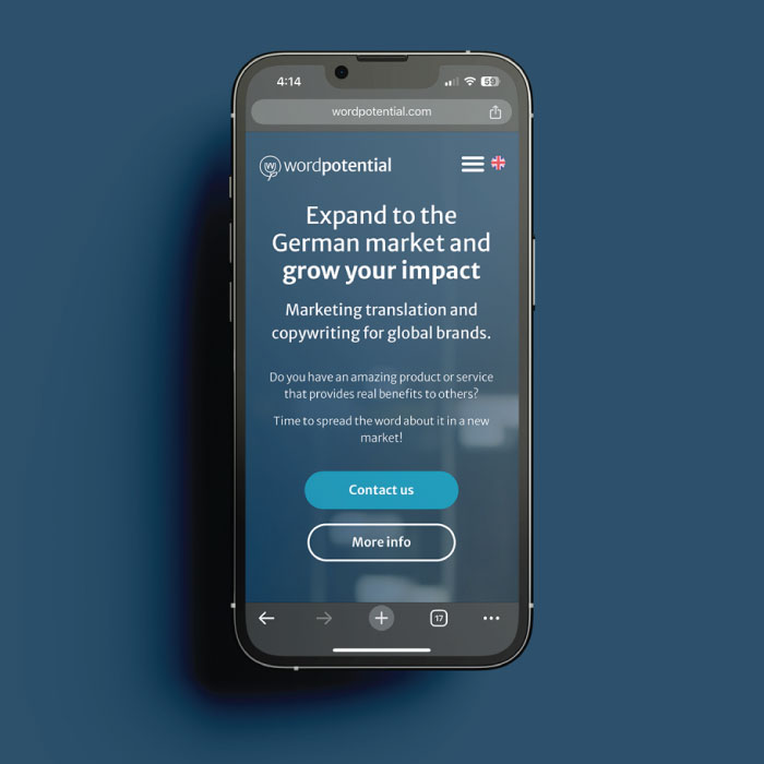
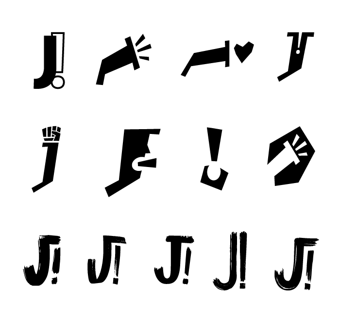
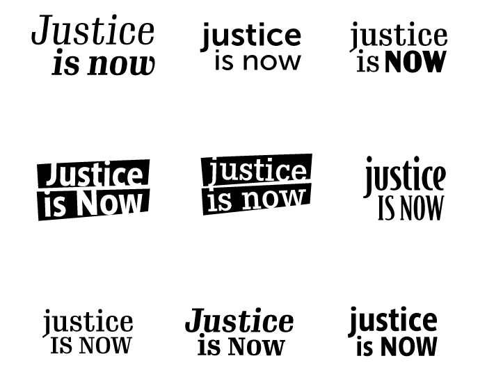
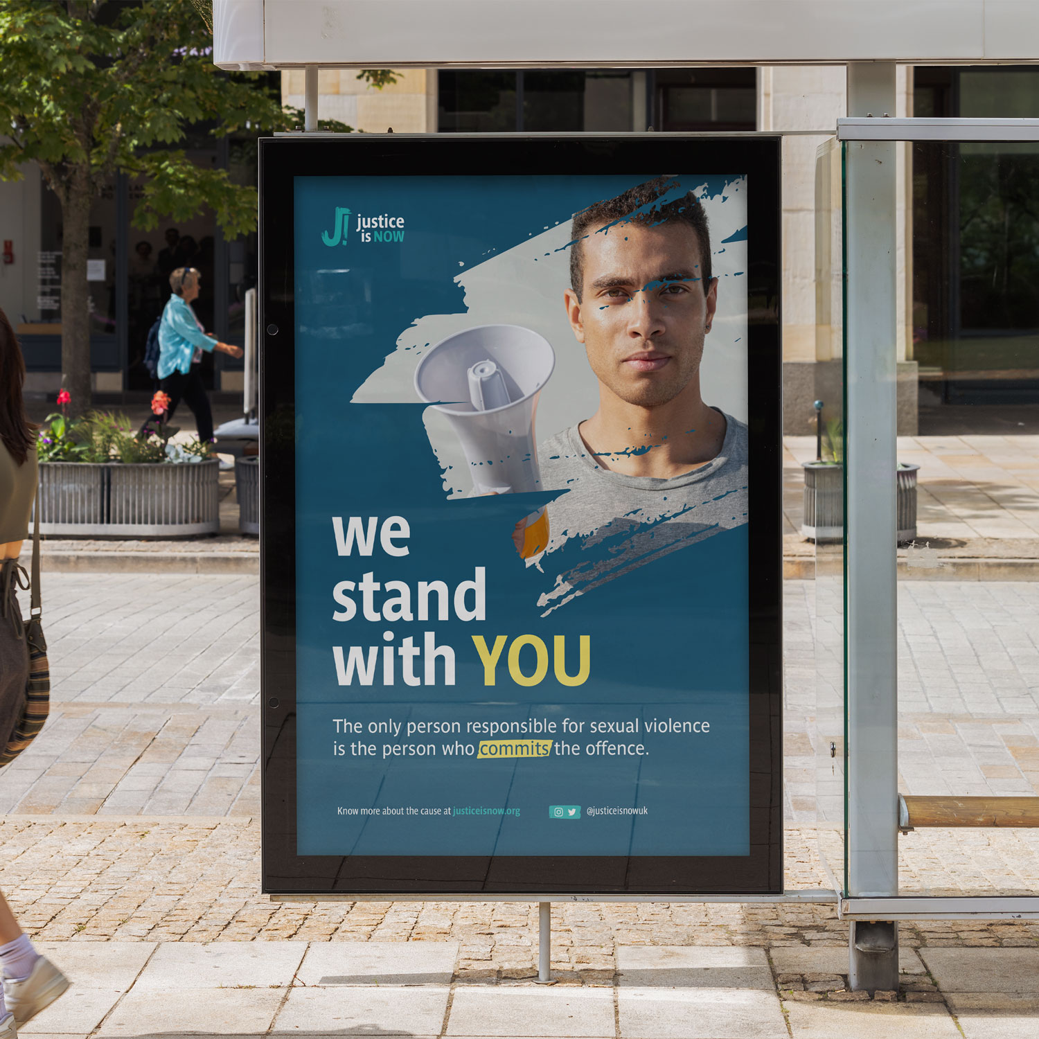
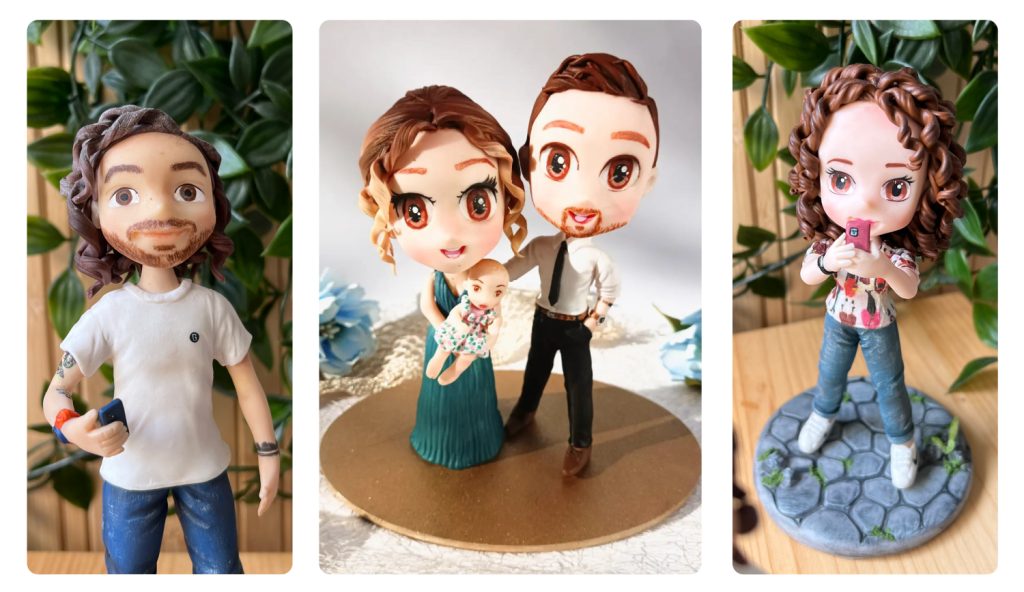
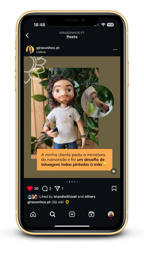
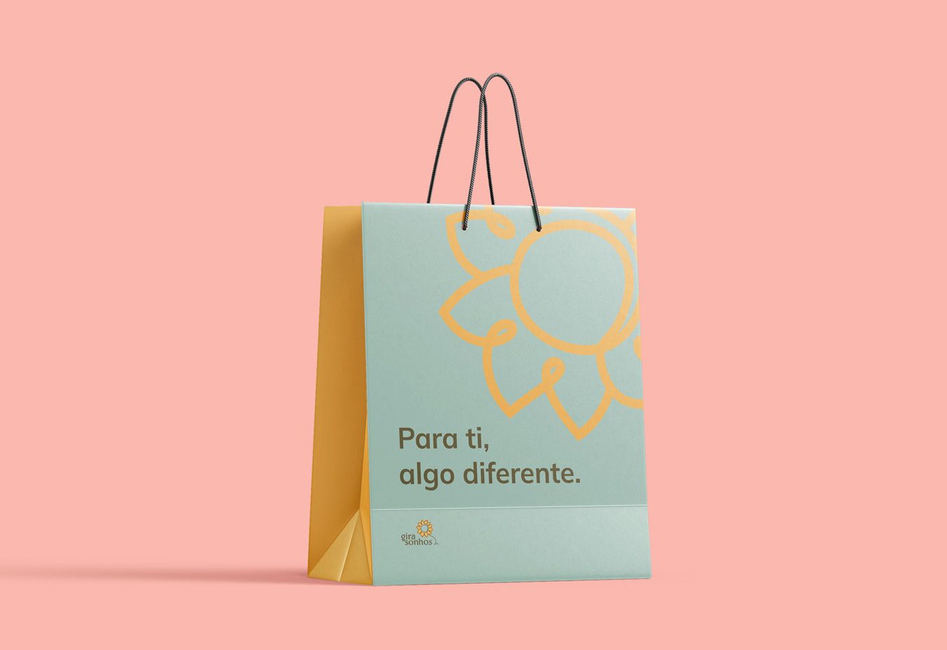
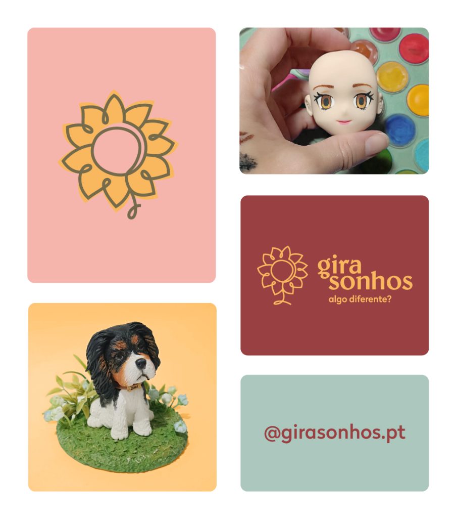
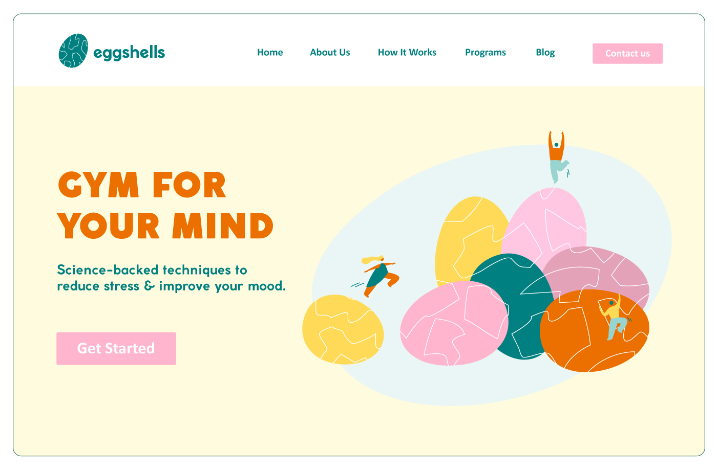
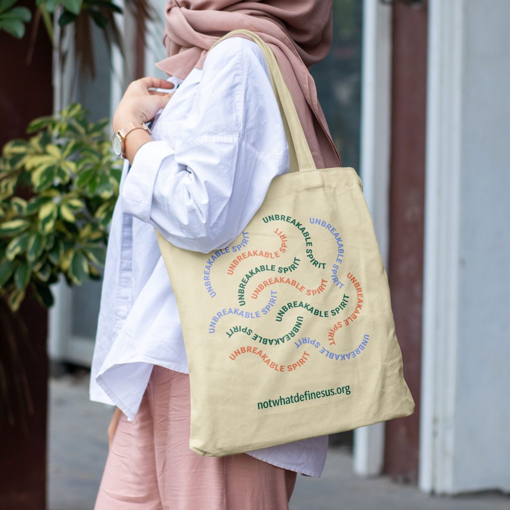
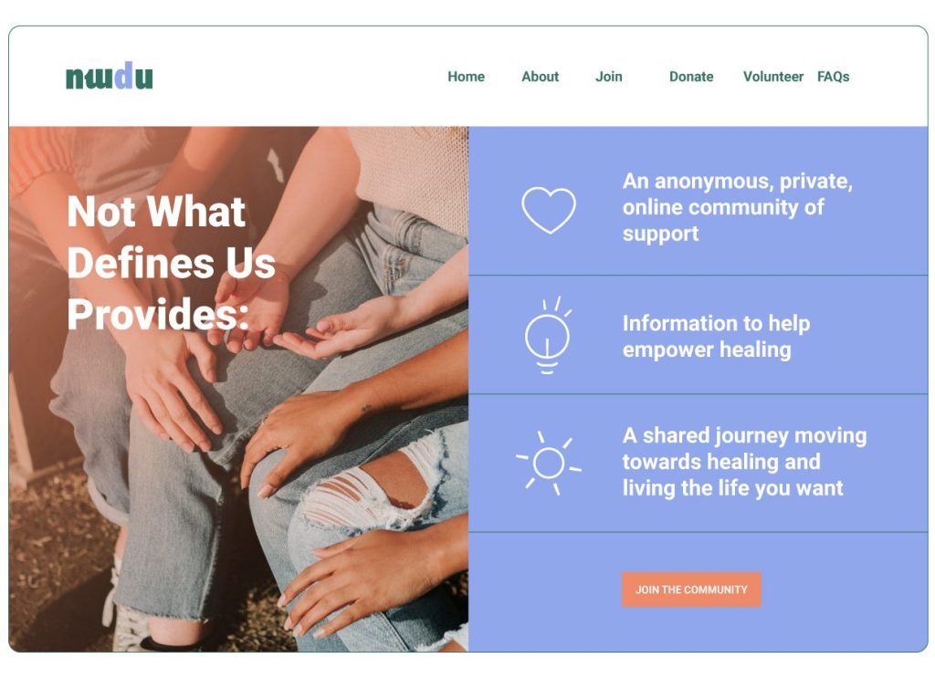
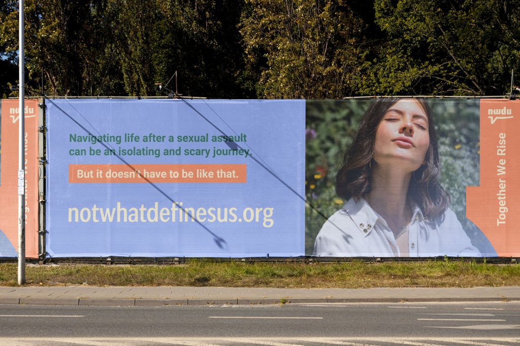
As opposed to sketchy visuals that are all over the place, a consistent design throughout your content, landing pages, emails, and more, will enlist trust in your audience, making it easier for them to contact you.
No, the free version will do.
My DMs are always open and you’ll have a chance to book a Brand Coffee Chat at a discounted rate.
No, I am not offering refunds for The DIY Brand Kit.

Build a brand you're proud of!

Build a brand
you're proud of!

© 2025 GrowingDesign. All rights reserved. Disclaimer | Terms & Conditions | Privacy Policy

Judy.B - web studio

Judy.B creates websites for small businesses and partners with them for digital marketing strategies to increase their visibility and help them reach their goals.
Deliverable

Brand Strategy & Identity

Client

Judy Bigham

Location

Massachussets, USA

Overview

Judy was going through a transformation in her business. Her web studio had grown into offering more than just websites. 

While those stay a pillar in what Judy offers, they’re now complemented with marketing strategies that drive traffic to them, helping her clients make the most of their investment.

“One-size-fits-all solutions do not work. Small businesses need to implement digital marketing efforts (even when they don’t know what that looks like) that best work for them and their day-to-day, their industry, and goals.

Judy.B creates tailored websites for small businesses and partners with them to grow with digital marketing strategies.

– Judy

Brand DNA

The Brand DNA is what we get from our custom-made brand strategy process. Through several in-depth sessions, we worked on 9 core concepts for Judy’s brand.
 
— Who, what, and why.
— Target audience and brand personas.
— Competitor analysis.

— USP and onliness statement.
— Brand name and story.
— Brand voice and values.
— Transformation statement.
— Slogans and tagline.
— Vision and mission.

 
It was only after this meticulous process that we were able to visually bring Judy’s brand to life.

Concept

Through the Brand DNA process, we decided to represent Judy’s appeal for a high-end aesthetic and style in her work.
 
Also, Judy’s entrepreneurial story started with a home staging business, and through our Brand DNA process again, we found numerous parallels between houses and websites.
 
The connection between her previous business and her current one was there. The rebrand’s focus became exactly that.
 
The representation of Judy’s story combined with metaphors between houses and business websites — something we now experience in her visual identity and messaging.
Brand color palette

Solution

A high-end, stylish monogram, and how websites are our businesses’ homes.
 

Paired with a confident word-mark that is complemented by numerous visual assets that revert us to architecture and home decoration.

While also bringing to life the metaphors in Judy’s brand messaging, between our homes and our business’s homes, our websites. 

Logo variations for every purpose
Re-written and redesigned LinkedIn profile
Custom-made social media post templates
Visual assets inspired in architecture and interior design
Unique business card design
Detailed Brand Guidelines Book

Outcome

Judy now has a brand identity that makes her stand out, matches her personality, embodies her brand messaging, and allows her to grow.

She is now able to create new marketing materials entirely on her own knowing they’ll always be on-brand, consistent, and eye-catching.

Happy Clients Say

Joel is a go-to for brand strategy. I worked with him to rebrand my web design business and after every session, felt the energy from the insights that I think only Joel could have provided for me. He guided me through his process, which is clear, simple and straightforward, making the strategy work seem easy (while it’s not) and fun (which it should be!).

– Judy Bigham

© 2025 GrowingDesign

fazenda machado

portuguese syntropic and regenerative farm based in the western region (zona Oeste)
deliverable

brand strategy & identity

client

Carina & Marco Machado

location

lisbon, pt

overview

Fazenda Machado is a Portuguese syntropic and regenerative farm that produces healthy products using a unique ingredient from the western region (Zona Oeste): the Rocha Pear (Pêra Rocha).
 
They have a wide range of products made with Pêra Rocha: Jams, juices, puree, and their star product — Pêra Rocha Tarts.

Studies show that the intensive monoculture model is unsustainable and detrimental to our health, farmers, and the environment.

The answer?

To adopt and promote syntropic and regenerative agriculture.

This model can be a more profitable and less risky alternative to intensive monoculture. It produces more nutritious and healthier food for people, preserves the soil, restores biodiversity, and is more resilient to climate change.

At Fazenda Machado, we combine different species of fruit trees, aromatic herbs, and native plants to create a balanced, self-sustaining ecosystem.

By eliminating the use of pesticides and chemical fertilizers, syntropic farming produces healthier, more nutritious, and higher-quality food.

One being: the Rocha Pear.

Native to the west region, the Rocha Pear is the star ingredient in our range of healthy, chemical-free products.

For a healthier future.

brand DNA

The Brand DNA is what we get from our custom-made brand strategy process. This was the first step to solve Carina and Marco’s disconnect with their own brand. 

Through several in-depth sessions, we worked on core concepts for the brand, Fazenda Machado.

 
— Who, what, and why.
— Target audience.
— USP and onliness statement.
— Brand name and story.
— Brand voice and values.
— Slogans and tagline.
— Vision and mission.
 
It was only after this meticulous process, that we were able to visually bring Fazenda Machado’s brand to life. See the result below.

concept

We focused on the Portuguese western region, the concept of regeneration, and the Pêra Rocha as the starting point for the design direction. We brainstormed a few ideas:

  • Using a line pattern inspired by topographic maps to recreate the pear’s shape and volume.
  • Representing the ideas of cycles and regeneration, which are the brand’s unique selling points.
  • Exploring serif and organic-style typography.
  • A nature-inspired color palette, specifically drawn from the tones found in Pêra Rocha skin at different stages, from green to fully ripe.

solution

The logomark features a stylized Pêra Rocha.

Its lower half is formed by two flowing, interlocking shapes as a visual nod to regenerative farming and nature’s inherent balance.

As for the typography, some letterforms were modified to add an organic and earthy feel, reinforcing the connection to the land and nature.

Custom letters, based on the pear’s shape

The letter "A" has two variations.

Modular mosaic containing 8 elements, each representing a key aspect of Fazenda Machado’s identity: the Portuguese western region, farming, their roots, and the practices employed in their daily work.

  1. Tree: Fazenda Machado’s orchards
  2. Cycle: syntropic farming & sustainability
  3. Wheat: harvested in the western region
  4. Pear: Pêra Rocha
  5. Snowflake: Royal Ice Factory of the Montejunto Mountain Range
  6. Windmill: present in the surrounding landscape
  7. Apple: Harvested in Fazenda Machado
  8. Mountain range: Montejunto

The Montejunto Mountain Range and the region’s climate are essential to the production of Pêra Rocha.
Based on that, we used the topographic map lines of the mountain range as a graphic element.

Inspired by the texture of Pêra Rocha skin, this natural detail serves as a secondary graphic element.

brand guidelines book

outcome

Fazenda Machado now has a brand identity that’s true to its roots, helping it stand out not just in the farming world but also in the consumable goods space.

Their products now feature thoughtful packaging design, from jam and juice labels to tart boxes. Beyond that, we created a wide range of brand assets ready to be used across social media, their website, and print.

©2025 GrowingDesign

Maven Advisory

Angi helps FinTech startups establish their sales and marketing foundations through go-to-market strategies so they can build sustainable growth.
Deliverable

Brand Strategy & Identity

Client

Angi Milano

Location

Chicago, USA

Overview

Earlier this year (2025) Angi felt a growing disconnect from her brand. “Nothing really feels like… me.”

As it’s far too common with solo-business owners, the problem ran deeper. 

After a first call, we quickly realized that the Maven Advisory’s design aesthetic, messaging, and overall online presence was not aligned with Angi’s vision, who she is, and what she wants to achieve. 

She had been following (and showing) what she thought she “had to”, instead of what’s true to her, and what Maven Advisory truly is.

What’s Maven Advisory?

Most fintech startups have inconsistent sales which lead to uncontrollable growth, jeopardizing the entire business. We solve this issue with a clear and intentional collaboration between sales and marketing efforts.

Maven’s mission is to guide early-stage FinTech startups in building sustainable growth. Through educational content and go-to-market strategies, Angi will help founders establish their sales and marketing foundations and stop making the most common mistakes.

Brand DNA

The Brand DNA is what we get from our custom-made brand strategy process. This was the first step to solve Angi’s disconnect with her own brand. 

Through several in-depth sessions, we worked on 9 core concepts for Angi’s brand, Maven Advisory.

 
— Who, what, and why.
— Target audience and brand personas.
— Competitor analysis.

— USP and onliness statement.
— Brand name and story.
— Brand voice and values.
— Transformation statement.
— Slogans and tagline.
— Vision and mission.

 
It was only after this meticulous process, that we were able to visually bring Angi’s brand to life. See the result below.

Concept

Through the Brand DNA process, we found the importance of highlighting Angi’s Argentinian roots and the long-lasting similarities found in art and architecture between Buenos Aires and Chicago.
 
The two cities Angi very proudly calls home.
Brand color palette

Solution

Inspired by the 1920s art deco and architecture, and today’s FinTech space, we worked on a balanced brand visual identity that shows who Angi is, and what Maven Advisory needs to be. The result? 

A timeless monogram and modern word-mark that makes Maven Advisory’s new logo, which in turn guides the new brand identity.
Logo versions for every purpose
Word-mark detail
Logo inspired brand pattern
Re-written and redesigned LinkedIn profile
Custom-made social media post templates
Unique business cards for events
Slide deck template for keynotes
We also designed and built Angi’s new website, mavenadvisory.co
A website that looks great on every device
And of course, a detailed brand guidelines book.

Outcome

Angi now has a brand identity that makes her stand out in the FinTech space, which also matches her personality, and allows her to grow.

She is now able to create new marketing materials entirely on her own knowing they’ll always be on-brand, consistent, and eye-catching.

Happy Clients Say

Working with Joel was the best decision I made for my brand. He doesn’t just design. He listens. His approach is mindful, intentional, and rooted in truly understanding you and your business.

The result? A brand and website that feel like me. Beautiful, professional, and effective.

No fluff, no ego, no BS. Just real partnership and work that delivers. If you want someone who gets it and knows how to bring your vision to life, Joel’s your guy.

– Angi Milano

© 2025 GrowingDesign

Hey, I'm Patrícia 👋

Brand visual identity designer & illustrator

I craft standout brand identities, packaging, and custom illustrations that turn your brand’s essence into visuals customers remember.

We’ll go beyond the logo and create a visual identity that reflects your values and speaks to your people.

No flashy visuals just for the sake of it, because design should feel like it belongs. It should connect.

This is where I do best:

✏️ Custom logo design
✏️ Brand color palettes, typography, and design elements
✏️ Illustration and brand collateral that brings everything together

Tell me what you’re building! I’d love to hear about it and chat about how we can bring it all together in a way that feels right 😁

Byting Chipmunck

Byting Chipmunk helps businesses facing inconsistent software management, transition to fully automated systems so they can make better use of their human power and become more efficient.
Deliverable

Brand Strategy & Identity

Client

Russell Smiley

Location

Ontario, Canada

Overview

“Late last year (2022) I was increasingly aware that I needed help with marketing as this was an area of business that I had not been exposed to previously in my career, and I wanted help to be more purposeful about how I was using social media. Fortunately I came across Joel’s activity on LinkedIn and decided to make contact.”

Russell is a veteran in his industry, now that he was flying solo he needed to grow an online presence that matched his expertise.

Byting Chipmunk is a software management business that helps businesses transition to automated software delivery, ensuring effective processes and better results.

“We aim to provide software integration and delivery automation services to businesses and to supply industry peers with resources, and off-the-shelf tooling that will make their work easier.”

Brand DNA

The Brand DNA is what we get from our custom-made brand strategy process. Through several in-depth sessions, we worked on 9 core concepts for Russell’s brand, Byting Chipmunk.
 
— Who, what, and why.
— Target audience and brand personas.
— Competitor analysis.

— USP and onliness statement.
— Brand name and story.
— Brand voice and values.
— Transformation statement.
— Slogans and tagline.
— Vision and mission.

 
It’s only after this meticulous process, that we were able to visually bring his brand to life.

Concept

The Byting Chipmunk is part of Russell’s brand origin story:

“The name came from a store clerk when my wife asked if they had Barking Squirrel in stock (yes, a real product name 😄) – he replied sarcastically “No, but what about Biting Chipmunk?”. Joke’s on him, he gave me a great brand name! 🤣” – Russell

Solution

The result is a very confident mascot with a vibrant color combination. 
 

That’s how we visually represent Russell’s tech-related brand, Byting Chipmunk. 

With his new LinkedIn profile, Russell got a set of social media post templates built in his Canva account. The total collection extended to 15+ templates.

Outcome

“Joel and I worked through his branding exercises which help me understand what I was trying to achieve as a business, who my prospective customers are and how my visual identity could align with those things. ” – Russell Smiley

Happy Clients Say

“I really valued the regular meetings with Joel and will miss the opportunity to chat with someone about business, social media and marketing. Joel was candid with his remarks and delivered useful criticism and suggestions about how I have been “doing social media”. I am super happy with the logos, social media templates and colour palette that Joel designed – it is now much easier to quickly put together posts with a consistent look.

I think any business, but particularly a solopreneur such as myself, will benefit from working through the branding exercises with Joel. I learned so many unexpected things.

Thanks Joel!”

– Russell Smiley

© 2024 GrowingDesign

Anna Burgess Yang

Anna provides how-to resources for those who need to optmize their back-end business operations.
Deliverable

Brand Strategy & Identity

Client

Anna Burgess Yang

Location

Chicago, USA

Overview

Anna Burgess Yang stands for a better relationship between your work and your life. We know how traditional work settings don’t value their workers enough, often putting them through stressful and uncertain situations and career paths. 

As a result, solopreneurship has become a much appealing option to a fulfilling work life.

Anna Burgess Yang is the go-to solopreneur educator for back-end business operations and management.

“I want to show those in corporate that change is possible by helping freelancers and small business owners grow stronger businesses.”
 
– Anna

Brand DNA

The Brand DNA is what we get from our custom-made brand strategy process. Through several in-depth sessions, we worked on 9 core concepts for Anna’s brand.

— Who, what, and why.
— Target audience and brand personas.
— Competitor analysis.

— USP and onliness statement.
— Brand name and story.
— Brand voice and values.
— Transformation statement.
— Slogans and tagline.
— Vision and mission.

 
It’s only after this meticulous process, that we were able to visually bring her brand to life.

Concept

The need to represent “idea” was an early on discovery from the Brand DNA process. 

The idea that business owners have of a better life, and the idea of their businesses. An idea.

That quickly became our focus and guidance for how we’d visually represent Anna’s brand.

Solution

The bulb, attached to a word-mark. 
 

That’s how we visually represent Anna’s personal brand. 

Anna helps others pursue to better their ideas, while providing better ideas on how to do so.

Anna motivates light-bulb moments.

Complete social media support was provided from the writing of the profiles to the design of all the necessary imagery paired with a diverse set of post templates.

15+ Social media Canva templates

You can meet Anna on LinkedIn!

Outcome

Anna now has a complete brand folder, and rich Canva account, with all the digital assets she needs to confidently create what her business needs.


From any kind of social media post, to in-depth workbooks and presentations, she knows she can count on her brand assets to create beautiful designs that represent her fully and resonate with her audience. 

Happy Clients Say

Joel is one of the most thoughtful collaborators I’ve ever worked with.

I knew my brand needed a major design uplift, and Joel did all of that and more. He was so thorough in understanding me, my brand, and my audience.

In addition to the overall brand design, I had significant needs related to my social media accounts and webinars I host. Joel took care of all of that, leaving me with hundreds of Canva templates to work with. I also have so much more clarity around my brand messaging after working with Joel.

Highly recommend working with him.

– Anna Burgess Yang
© 2024 GrowingDesign

Fruition Initiatives

Sarah is an independent COO who helps established business owners scale on their terms through strategic goals. Fruition Initiaves is how Sarah and her team help bring those goals to life.
Deliverable

Brand Strategy & Identity

Client

Sarah Duran

Location

Colorado, USA

Overview

Sarah was at crossroads in her business. Fruition Initiatives had grown into multiple active avenues all sharing her big vision: to make business owners never settle for less. But it all felt disjointed.

Our rebranding project was how we aligned every initiative under the same brand, Fruition Initiatives. No more looking like she was running a few side-hustles stapled together, it all now aligns towards the same goal.

Fruition Initiatives offers business owners a strategic partnership tailored to their challenges by following an agile method.

Unlike most business coaches, Sarah’s support focuses on business strategy and operations without following a fixed program, ensuring her clients get the help they truly need, not a fixed-step program.

Brand DNA

The Brand DNA is what we get from our custom-made brand strategy process. Through several in-depth sessions, we worked on 9 core concepts for Sarah’s main brand, Fruition Initiatives.
 
— Who, what, and why.
— Target audience and brand personas.
— Competitor analysis.

— USP and onliness statement.
— Brand name and story.
— Brand voice and values.
— Transformation statement.
— Slogans and tagline.
— Vision and mission.

 
It’s only after this meticulous process, that we were able to visually bring Sarah’s brand to life.

Concept

Through the Brand DNA process, we found the importance of highlighting the 3 main pillars of Sarah’s coaching method.

Work.
Worth.
Wisdom.

And how we as business owners need to find where and how the 3 overlap – as that’s where we not only do our best work but also find the most fulfillment.

This idea became the guiding concept for the logo design.

Solution

The overlapping pillars meeting at the center. 
 

We want to represent movement, as business is never a stagnant journey. We want to guide our audience towards the center, where the 3 pillars overlap, where we find fulfillment.

Fruition Initiatives has 3 sub-brands.
The Future is Freelance for Sarah’s podcast.
The Hustler’s Manifesto for the long-form written content — blog and email newsletter.
The Solopreneur Collaborative which is Sarah’s ongoing coaching program.

Fruition Initiatives’ brand identity is versatile to both include the 3 sub-brands and stay open to new initiatives that will soon come.

Sarah’s online presence fuels the Fruitive Initiatives’ brand. You can meet her on LinkedIn.

Custom-made templates
Linkedin cover + Featured section
Slide deck template
Youtube channel

Outcome

Sarah now has a brand identity that makes her stand out, matches her personality, and allows her to grow. She is now able to create new marketing materials entirely on her own knowing they’ll always be on-brand, consistent, and eye-catching.

Happy Clients Say

Working with Joel is the best thing that ever happened to my brand!

Joel is a top-tier branding expert. He walked me through a process that uncovered my unique value proposition and translated it seamlessly into a stunning visual brand. He was also there every step of the way for questions and continues to be a valued thought partner as I implement the new brand. I cannot recommend Joel enough!

– Sarah Duran
© 2024 GrowingDesign

WordPotential

Marketing translation and copywriting team for brands who want to expand to the German market, and grow in the online space.
Deliverable

Brand Strategy & Identity

Client

Laura Timm

Location

Tenerife, Canary Islands

Overview

“Initially, I contacted Joel for a re-do of my LinkedIn profile to reach more clients for my translation and copywriting business. After our first call, I decided to take the whole branding package.”

We realised that Laura needed to work on her brand and business foundations before investing in a new LinkedIn profile. And that’s what we did. Out of our first phase, WordPotential was born.

“WordPotential is the go-to partner for those who need to leverage the cultural and language nuances of the German market to stand out with their unique story, increase their brand awareness, and build strong relationships with their customers. 

To do so, WordPotential will provide storytelling-infused marketing translation and copywriting services.”
 
Laura Timm – Founder

Brand DNA

The Brand DNA is what we get from our custom-made brand strategy process. Through several in-depth sessions, we worked on 9 core concepts for Laura’s brand, WordPotential.
 
— Who, what, and why.
— Target audience and brand personas.
— Competitor analysis.

— USP and onliness statement.
— Brand name and story.
— Brand voice and values.
— Transformation statement.
— Slogans and tagline.
— Vision and mission.

 
It was only after this meticulous process, that we were able to visually bring her brand to life.

Concept

The need to represent “potential” was an early on discovery from the Brand DNA process. That quickly became our focus and guidance for how we’d visually represent Laura’s brand.
 
But we couldn’t ignore her story. 

Her strong connection to Tenerife had also to be present.

Solution

The flower, the “w”, and the color choice. 
 

That’s how we visually represent Laura’s dynamic brand, WordPotential. 

We show potential with a growing flower, in a deep blue tone that is inspired by Tenerife’s ocean water. And of course, the hidden “w” as it’s the brand’s initial.

WordPotential website

Business card design
WordPotential website

For different collateral, like the business card and website seen above we created a set of icons to support the brand’s message and content.

Laura’s online presence fuels WordPotential’s brand. You can meet her on LinkedIn and Instagram.

Screens from the WordPotential website

Outcome

“Ever since Joel branded my business to life by working out my entire Brand DNA, including all the visual elements, he’s been my go-to person for all WordPotential designs. He helped me create our website with a proper portfolio, and all my trade fair assets (banner, business cards, flyers, goodies).” – Laura Timm
 
WordPotential now has a working online sales funnel that covers Laura’s social media presence, self-hosted content in form of relevant blog articles and interviews, and a monthly email newsletter. 

Happy Clients Say

“Joel and I worked together to lay the foundations of my business, which, at the time, were anything but clear. We went through the Who?, What?, How?, over to my vision, mission, and USP. We even did a full competitor analysis to identify aspects of my business that I could improve to make it stand out of the crowd. 

And, of course, I also got the most beautiful logo, colour palette and fonts ever, along with useful social media templates.

I wholeheartedly recommend Joel to anyone who not only wants a fantastic brand identity, but also a solid foundation and direction for their business.

Joel is not just a design professional; he’s also a wonderful person who’s ready to go the extra mile to turn your vision into reality.”

 
– Laura Timm
© 2024 GrowingDesign

justice is now

organization focused on advocating for a change in the treatment of rape victims in UK criminal courts
deliverable

brand identity

client

Justice Is Now Organization

location

manchester, uk

overview

Justice Is Now is a non-profit organization that aims to combat the use of rape myths as defense tactics in courtrooms and increase the conviction rate for rape cases. The organization was created in honor of sexual assault victims and aims to end the practice of victim blaming and educate the public about the realities of sexual assault. Their goal is to ensure that future victims do not have to endure the injustice of rape myths being used in court.

The conviction rate for rape has gone from 6.5% to 3.5% in the UK. Research shows that too many people believe rape myths and victim blame, and these people are the same people who end up on juries.

The only person responsible for sexual violence is the person who commits the offense.

Our goal is to create a world where justice for victims of sexual violence is not the exception but the norm.

We intend to get there by:

  • Advocate for a change in the treatment of rape victims in UK criminal courts and an end to rape myths used in society.
  • Challenge victim blaming and sexual violence myths.
  • Highlight cases of reporting in the media which victim blame.
  • Lobby for mandatory training for juries hearing crimes involving sexual violence.
  • Campaign for an end to defense barristers using victim-blaming myths during cross-examination.

concept

We focused on creating visuals that pass on a strong sense of urgency, aligning with the core goals of the organization: speaking up, protesting, and raising awareness through powerful voices.

To convey this message, we explored protest symbols like exclamation points, megaphones, raised fists, and a mix of undercase and capitalized words to create visual contrast and emphasize strength and conviction.

solution

Inspired by the handwritten signs often seen at protests, we embraced this raw, expressive aesthetic to reflect the movement’s authenticity and passion.

To reinforce the message, we incorporated expressive symbols like the exclamation point (!) into the logomark, effectively conveying urgency, authority, and the assertiveness of our shared beliefs.

The brush stroke style gives the logo an expressive yet accessible look, making it easy for anyone to draw it on a sign, t-shirt, or flag and show support for the cause.
 

outcome

With the new brand identity, JIN now has a strong and cohesive visual representation that will help them effectively communicate their cause to the public. The new logo concept, with its brush stroke style and expressive yet accessible look, serves as a symbol of resistance and protest.

The new assets will be a powerful tool for JIN to spread its message and inspire more people to join its cause.
©2024 GrowingDesign

canopie

app and digital program addressed to parental mental health (for expecting and new parents)
deliverable

illustration

client

Canopie

location

virginia, usa

overview

Ann & Anne support expecting women and new mothers through common motherhood challenges.

Together, they launched Canopie—a free, evidence-based app designed to improve maternal mental health and address the significant gap in care. Canopie provides clinically effective, flexible care through short, personalized audio programs that offer a humanizing approach to maternal wellness.

Our goal is to create effective, compassionate care for new moms. This means rethinking prenatal and postpartum care to fully address mothers’ emotional health.

It’s about caring for every mom, no matter where she is or her access to resources—high-quality care for everyone.

We’re offering a maternal mental health solution that’s impactful because it reaches moms at scale, right in their homes, at their convenience—especially during a time when traveling or scheduling isn’t an option. It’s critical, as 85% of new moms struggling with anxiety and depression aren’t receiving the treatment they need.

– Ann & Anne

concept

The name “Canopie” is inspired by the idea of a “canopy” that provides warmth, strength, and resilience, creating a sense of protection and support as mothers grow through their journey.

We expanded the logo’s aesthetic into a series of nature-inspired illustrations, emphasizing growth and transformation in a calm, nurturing environment – all of them are drawn with a limited number of geometric shapes, giving us unlimited composition options.

solution

Natural elements like birds, flowers, and mountains were chosen to evoke freedom, lightness, and calm, coming together like a peaceful landscape.

We also included mama and baby characters with restful expressions to emphasize the desired mood and human connection.

Baby's gestational size represented as fruits

outcome

When we met, Canopie’s visuals didn’t fully convey the message or energy it deserved. Lacking graphic cohesion, the visuals were created in-house using clipart-based images without structure or visual thinking.

Now, Ann & Anne have a refined app interface featuring cohesive, on-brand illustrations that radiate the right energy. Each element is thoughtfully arranged, creating an enjoyable and intuitive user experience.

happy clients say

We absolutely loved working with Patrícia! 
She was flexible, open to feedback, produced lovely, high-quality work.
She was great, and we can’t wait to keep working with her!
 
Anne & Ann

gira sonhos

unique, artistic and meaningful handmade gifts - for special moments and stages of life
deliverable

brand identity

client

Sandra Malho

location

lisbon, portugal

overview

Sandra is a local talented artist and friend, who crafts beautiful personalized figurines. She’s been running her business for some time, and felt ready to take it to the next level. Unsure of how to improve her online presence and knowing it was affecting her sales, she reached out to Joel and me for help with brand strategy and visual identity. And we were THRILLED to get started!

Gira Sonhos is dedicated to the important people in our lives — those we should cherish most.

It helps people to give with intention, putting an end to unnecessary gifts and empty gestures. While combating unconscious consumerism, Gira Sonhos gives us the chance to show genuine appreciation.

As a person who has difficulty expressing what goes in my soul, art is my way of saying “I like you”, “you’re important to me” or even a simple “thank you”.

I like to offer something that makes the other person feel special and loved.

Something different.

– Sandra Malho

concept

The name Gira Sonhos is inspired by two Portuguese words: girassol (sunflower) and sonhos (dreams).

Sandra feels a deep connection with sunflowers and wanted this to be part of her brand identity. Since this is a personal project, it only made sense to reflect Sandra’s personality and ethic values in the design.

In the draft phase, we explored several sunflower variations, as well as typography that would align with Sandra’s vision.

Key attributes we highlighted:

  • Calmness
  • Friendliness
  • Emotion
  • Family
  • Altruism
  • Honesty

solution

The logomark features a hand-drawn sunflower, symbolizing the artisanal and handcrafted techniques Sandra uses in her figurines.

To highlight the sunflower’s unique characteristic—its natural tendency to turn toward the sun—we created multiple logo iterations, each showing the sunflower in a different position, as if it were following its light.

outcome

Thanks to the Brand DNA and brand identity process, Sandra now understands her audience, competitors, and how she wants to be perceived.

She’s confident in her online presence, knowing exactly what to post, how to post it, and how to use these tools strategically. With a brand identity that reflects who she is and connects with the right audience, she’s growing her presence effectively — and with real results, including orders from abroad within 2 months after launch.

know the project: @girasonhos.pt

©2024 GrowingDesign

view from 32

advisory firm focused on beauty industry
deliverable

brand identity

client

view from 32 firm

location

los angeles, usa

overview

View From 32 was founded by Gabriella, Cassie, and Lindsay — three women with a passion for beauty. With a strong industry background from their time at Sephora’s headquarters in San Francisco, they bring both expertise and friendship into their work.

Their services include strategy, consulting, and expert advice to help beauty brands achieve their business goals. As thought partners, they guide clients through the competitive beauty market, empowering them to succeed.

A bit of their story:

A nod to the famed 32nd floor of the iconic retailer that gave the trio an unparalleled perspective of the industry as well as access to some of its most important leaders, executives, founders, investors and creatives, the name View from 32 pays homage to their combined time of over 25 years at Sephora.

It wasn’t until a summer trip to Portugal in 2022 when Cassie, Gaby and Lindsay officially decided to join forces and continue to steer brands towards success—this time, as a powerhouse of three. Over verdejos at the beach, they toasted to friendship, passion and continuing to leave their mark on the beauty industry as View from 32.

concept

When we started working together, their vision was to create a logo mark that combined elements of beauty products and a building, symbolizing their origin story.

While buildings are often associated with construction companies, real estate agencies, or architecture firms, we wanted to challenge that convention. How intriguing would it be to design a construction-inspired logo with a chic and feminine touch?

  • beauty + construction crossover
  • chic contractor vibe
  • 3 blocks (3 members) combined into a tall a structure
  • 32 implemented in the name

solution

After exploring various drafts, we ultimately decided to take a different direction, opting for a modern, feminine eye shape inspired by Greek motifs, which directly ties into the company name.

The chosen typography is bold yet chic, reminiscent of boutique brands and contemporary, welcoming hotels.

This eye shape is simple and elegant, effectively conveying the concept of ‘view,’ while the typography adds a professional yet stylish touch, making the logo both visually impactful and memorable.

outcome

View From 32 now boasts a cohesive and distinctive brand identity that perfectly reflects its core message and personality. The logo’s modern, feminine, and chic elements, along with the premium color palette, seamlessly embody the tailored, high-end experience the brand offers each client.
 
©2024 GrowingDesign

eggshells

science-based online mental health program
deliverable

illustration

client

Ann Don Bosco

location

london, uk

overview

Eggshells is an online platform providing evidence-based mental health support outside of crisis situations.
 
Unlike our approach to physical health, where we go to the gym and only see a doctor for emergencies, mental health often offers only one option: seeing a doctor. Eggshells aims to change that by offering a “gym for the mind” experience. 

Usually people wait until they are ‘bad enough’ to get support but we believe that almost everyone could benefit from learning evidence based mental health techniques

What we’re doing as a brand is also really trying to normalise mental health challenges and tackle stigma. We know stigma is one of the reasons people don’t access support so it feels really important to do.
 
Ann Don Bosco – Founder

concept

The name “Eggshells” symbolises breaking free from the constraints of walking on eggshells, encouraging open conversation about feelings while maintaining a lighthearted tone.

The illustrations feature the cracked egg as the main element, accompanied by simple human figures in various positions and interactions. These illustrations aim to convey the concept of acknowledging our feelings, accepting our mental state, and working on our mental health.

solution

The human figures are depicted hugging the eggs, juggling them, climbing on them, jumping over them, and examining them.

These actions symbolise the different ways we engage with our emotions and challenges. The size variations of the eggs, with some smaller than the human figures and others larger, represent the varying sizes and complexities of our personal issues.

By embracing our vulnerabilities and actively working towards improvement, we can foster a positive and supportive approach to our mental health journey.

We decided to tweak their logo to match the illustrations’ look and feel. 

outcome

By incorporating these brand elements throughout the communication mediums, they effectively communicate the vision of Eggshells. They show an inclusive space where visitors can embrace their vulnerabilities, work on their mental health, and find inspiration for their journeys.
Overall, the brand identity and illustrations reinforce the message that it’s okay to show our vulnerabilities, and by doing so, anyone can actively improve their mental well-being.
 
©2025 GrowingDesign

not what defines us

online support community for victims of sexual assault
deliverable

brand identity

client

Patricia DePietto

location

new york, usa

overview

Patricia reached out for help with launching her latest project. Her website had valuable content but lacked a cohesive visual identity, relying too much on default platform graphics. After discussing her goals, we collaborated to create a custom visual identity for NWDU that aligned with her brand and resonated with the target audience.

At the heart of Not What Defines Us is a commitment to empowering survivors to heal, grow, and reclaim control over their lives. We recognize the strength within every survivor and believe that sharing experiences and insights can be a powerful catalyst for healing.

Our mission is to foster a community where survivors feel understood, supported, and equipped with the knowledge needed to navigate their healing journey.
 
Patricia DePietto – Founder

concept

We decided to focus on the Healing Journey and Breaking Stigmas by visually deconstruct the concept of being “defined” by past experiences and celebrate the diversity and resilience of survivors.
 
The goal is to convey a sense of empowerment, highlighting the idea that survivors are not shaped by what happened to them and are free to build their lives as they wish. 
 
During the exploration phase, we tested some ideas such as:
 
• playing with different letter widths
• break the name in unexpected ways
• play with the idea of path
• use of bold typography

solution

Some letters have a twist: the O is a C, the W is an M, the F is a T, the E is an A;
 

By manipulating the letters, we challenge the status quo, showing that no one is defined by convention, but by conviction; Just as the letters in the logo can be rearranged and transformed, survivors have the power to redefine their own narratives;

The bubble speech reinforces the idea of creating a safe space to share experiences and have their voices heard, as well as the importance of open communication and dialogue within the community;

outcome

NWDU now holds a custom, thoughtfully designed visual identity that makes a strong impact and resonates with the desired audience. This cohesive identity enhances all brand touchpoints, allowing recognition and trust: the website and social media platforms consistently utilize these elements and colors, ensuring a unified and memorable brand presence.
 
Know more about the project at:

happy clients say

“Patricia was amazing to work with, she really cared about the project, had great ideas and went above and beyond to make the deliverable awesome. I would recommend and I will rehire in the future!”
 
Patricia DePietto

Ready to show up as the expert we know you are?

Fill out this form, and we’ll get back to you in a minute 😎

This site is protected by reCAPTCHA and the Google Privacy Policy and Terms of Service apply.

Alternatively, DM us on your favorite platform ☺️

Hi, I'm Joel 👋

Brand strategist & designer

Brand strategist and designer for solopreneurs who want to stand out, be seen, and get hired(!) as the experts that they are.

I’ve been a freelancer, service provider, solopreneur, [insert any other possible title here, you know what I’m talking about] for over 10 years – aka my entire professional career.
 
In 2020 I got tired of working with “bigger businesses” and all the corporate nonsense that came with them, fired all my ongoing clients and started fresh in 2021 to focus on working with people like us.
 
That was only possible because I’ve invested so much time and effort in my personal brand.
 
And that’s the journey I want to take you on.
 
We build brands that not only stand out but also stand for something + get you what you need.