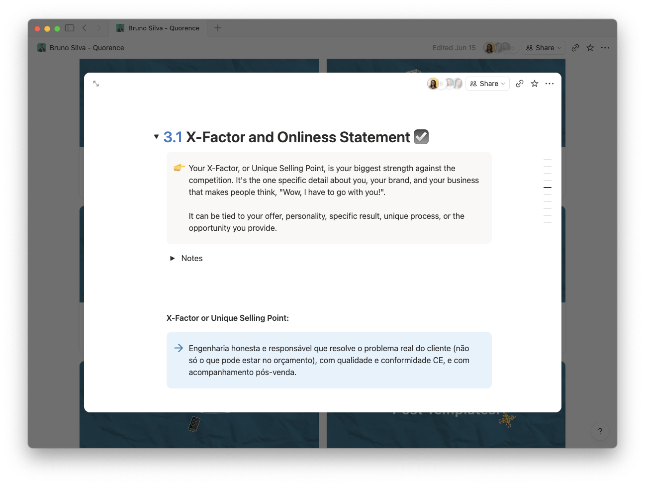
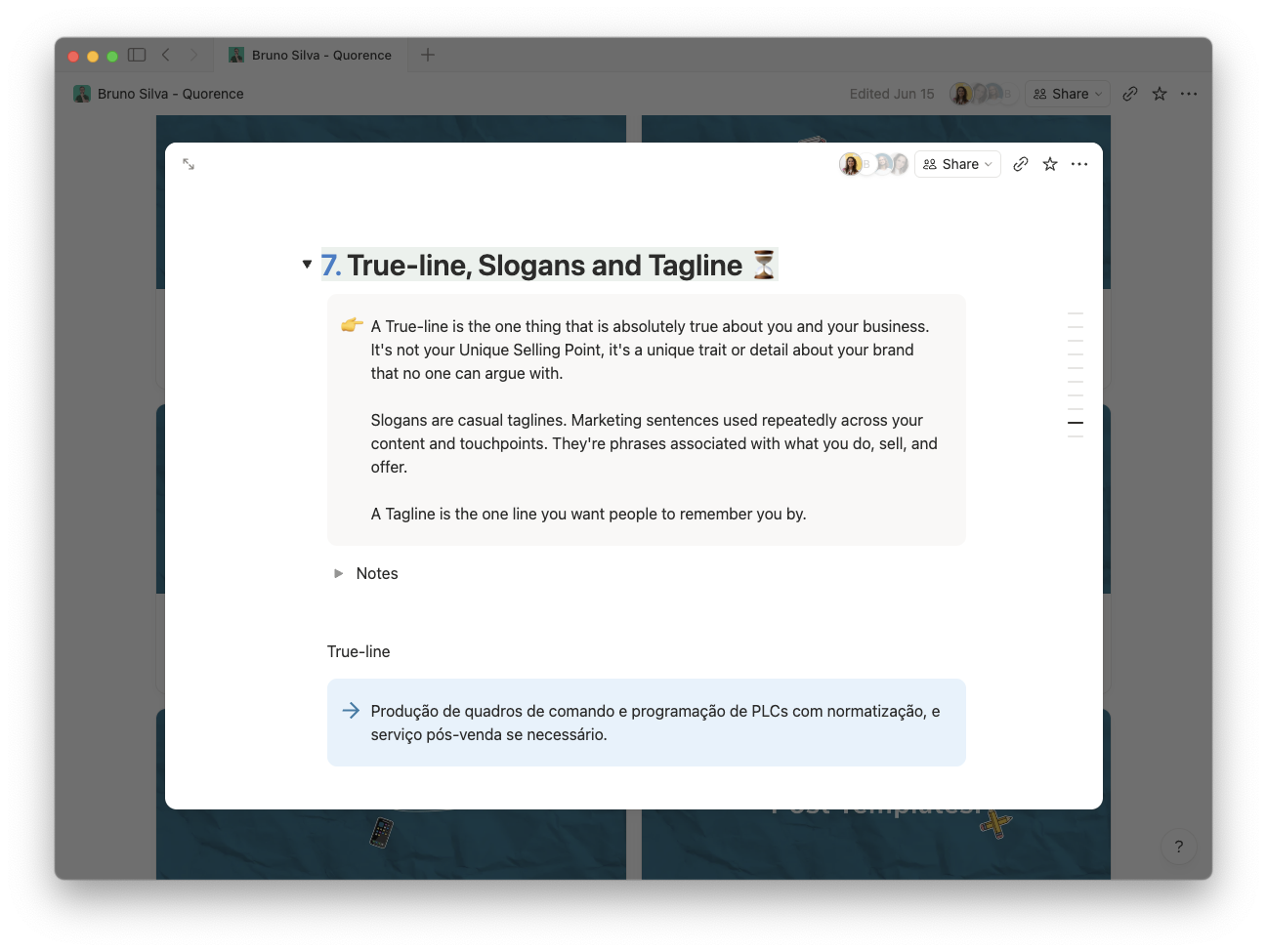
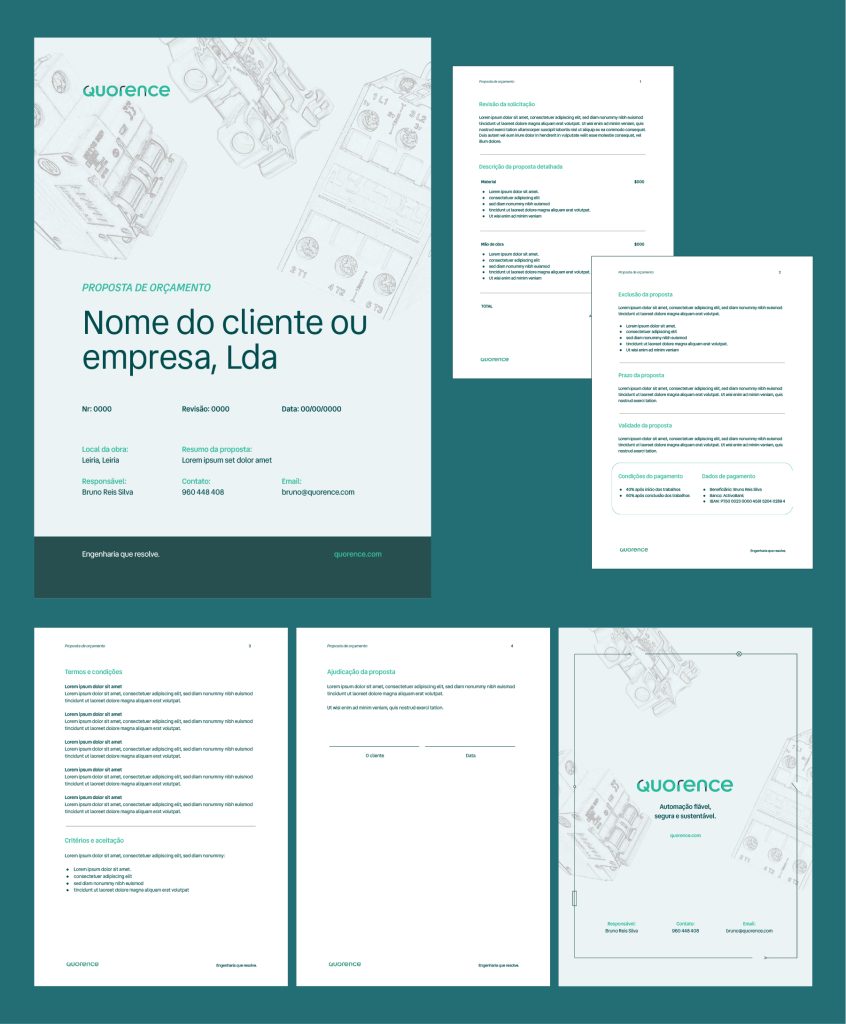
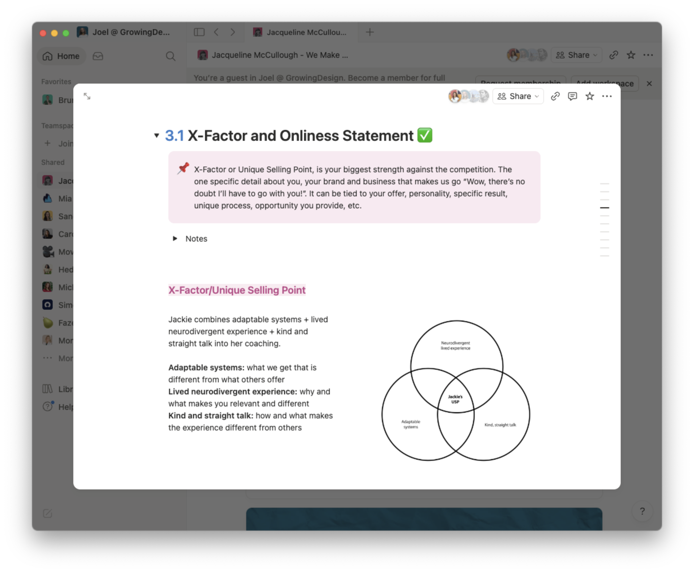
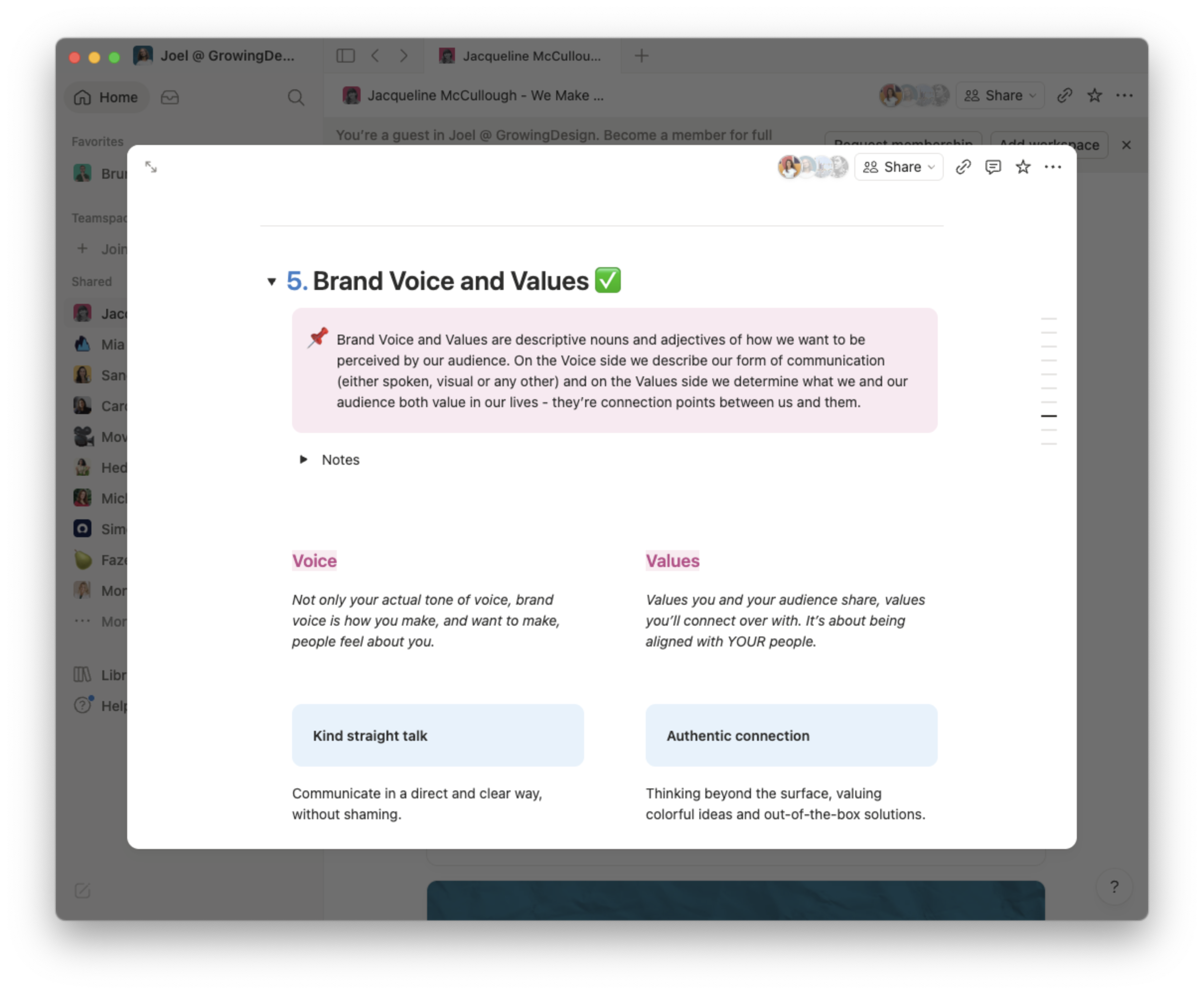
Branded to Life.
Stop being seen as a rookie, and get hired as the expert you know you are.
Rookie or leader? Your brand decides.
It’s not just about a logo or random social posts. What you need is something that shouts ‘This is me!’ and truly resonates with your audience.
Your brand should be a reflection of you – 100% authentic, reflecting your true value and purpose. It’s time to stop feeling like your brand is just ‘meh’ and start making it as awesome as you know your business is.
Ready?
What you need is a process that digs deep into what makes your brand special, and then turns that into a killer visual identity.
Think unique logos, a color palette that’s all you, typography that speaks your language, and images that show off your expertise.
Plus, we’ll revamp your social media to make it crystal clear that you’re the boss, and create a landing page that helps convert your visitors into clients.
People see you as an online buddy, but hardly anyone wants to hire you.
Every time you look at your Instagram or LinkedIn profile it makes you cringe.
You’re tired of staring at blank pages on Canva or worse, using the same templates as your competitors.
You’ve made some noise by yourself, but now you’re ready to build a concrete space for you online.
If this sounds like you – Branded to Life will get you to your next level in business.
A deep-dive process that digs into the core of your brand. We get together to work on high-level brand strategy exercises using my exclusive Brand DNA framework. We will study your ideal client, competitors, goals, what makes you different, and 5 more attributes that compose your Brand DNA. This will be the baseline to build a brand you’re (finally) proud of.
Included
Next, we translate your Brand DNA into visual language. Starting with a mood board, we craft a visual identity that’s true to you, making you stand out in your unique way. This is how we will differentiate you from competitors.
Included
Now, let’s bring your brand to life across social media. Leveraging the work from previous phases, we revamp every aspect of your social profiles, turning them into a showcase of your leadership, complemented by a suite of on-brand post templates.
Included
A landing page is what you’re seeing here now. And you got here through my Instagram or LinkedIn. You need one as well to send people to when they want to get all the details and see if they’re the right person to work with you. In this phase, We craft a landing page that draws people in and helps convert visitors into clients.
Included
We wrap up with a detailed brand guidelines book and a folder with every asset, file, and document you need to make a killing online. Plus, every template will be built into your Canva account.
Branded to Life averages at USD $3,500 — for the 4 phases, paid in 4 milestones, one per each phase. (You might not need everything!)
If you’re ready to rebuild your brand into a powerhouse that truly reflects your expertise and attracts the success you deserve…
Branded to life will give your brand a new life.
I’ll give you all my branding secrets and equip you with top-notch assets, sure. But this? It’s a team effort from day one. Once we are done it’s on you to continue to build and grow your brand in the market.
Building a brand isn’t an overnight thing. It’s a unique, ongoing process for each person. I’ll hand you the keys to the kingdom, but you’re the one who has to unlock the door.
You’re the hero of this story, and I’m here to be your trusty sidekick.
“There is now coherence between myself and the visual representation of my business, and it feels fantastic!”
– Lisa Di Domenico
“Joel transformed my brand – not just the identity but my message – how I show up. He helped me gain the confidence and clarity to step out from the shadows and show up unapologetic as fuck.”
– Susan-Marie Smith
“I’ve gone from people asking for all-singing, all-dancing services for about £100 per month to finally attracting high-ticket clients and winning work that I’m passionate about.”
– Susan-Marie Smith
“Working with Joel has given me the confidence to show up authentically as myself and a clear path and strategy to grow my business. Daily tasks, i.e. creating content, providing for my clients, and packing my services, have become that much easier and more enjoyable.”
– Emily Gillespie
“Joel gave me not only clarity and direction, but opened my mind to new ideas as I move forward in my business. I knew where I was going before but, man, NOW… I feel like I’m in overdrive!”
– Lindsey Burda
“We nailed down the messaging, the look, and feel of my business, so that I can confidently market my brand to the world. That’s what branding is — not just the logo and visual components of your business”
– Rebecca Scott
👆 All snippets from my Recommendations section on my LinkedIn profile. Go read the full stories.
Have a crystal-clear understanding of your business, brand, and purpose like never before. Every detail will be sharp and focused in your mind.
Step up with newfound confidence, showing up as the real you, the way you’ve always wanted, knowing it’s the absolute best approach.
Look and feel like the industry leader you are, with every part of your brand echoing your expertise and authority.
Have everything in place to create content like a mad person knowing it will be always on-brand, always resonating with your audience.
This journey transformed my life, and I’m confident it’s exactly what you need to transform yours.
My journey began in 2014 as a freelance graphic designer, juggling a bit of everything and grabbing every chance that came my way. It was a grind, but it laid the groundwork for what was to come.
The real game-changer came in 2020 when I focused on building my personal brand. That’s when the magic happened. I transformed from the go-to guy for cheap gigs into a sought-after brand strategist and designer, a role that’s not just for anyone.
As a result, people stopped looking at me as a cheap commodity and started queuing at the virtual door of my online business to have me on board.
My clients walk away not only with a full set of visual assets, but with a better understanding of their own brand (and themselves?) and the confidence to market their businesses the right way.
That’s the journey I want to take you on.
Let’s build a brand that not only stands out but also stands for something.
© 2024 GrowingDesign. All rights reserved. Disclaimer | Terms & Conditions | Privacy Policy
Brand Strategy & Identity
Sarah Duran
Colorado, USA
Sarah was at crossroads in her business. Fruition Initiatives had grown into multiple active avenues all sharing her big vision: to make business owners never settle for less. But it all felt disjointed.
Our rebranding project was how we aligned every initiative under the same brand, Fruition Initiatives. No more looking like she was running a few side-hustles stapled together, it all now aligns towards the same goal.
Fruition Initiatives offers business owners a strategic partnership tailored to their challenges by following an agile method.
Unlike most business coaches, Sarah’s support focuses on business strategy and operations without following a fixed program, ensuring her clients get the help they truly need, not a fixed-step program.
— USP and onliness statement.
— Brand name and story.
— Brand voice and values.
— Transformation statement.
— Slogans and tagline.
— Vision and mission.
We want to represent movement, as business is never a stagnant journey. We want to guide our audience towards the center, where the 3 pillars overlap, where we find fulfillment.
Fruition Initiatives’ brand identity is versatile to both include the 3 sub-brands and stay open to new initiatives that will soon come.
Sarah’s online presence fuels the Fruitive Initiatives’ brand. You can meet her on LinkedIn.
Brand Strategy & Identity
Laura Timm
Tenerife, Canary Islands
“Initially, I contacted Joel for a re-do of my LinkedIn profile to reach more clients for my translation and copywriting business. After our first call, I decided to take the whole branding package.”
We realised that Laura needed to work on her brand and business foundations before investing in a new LinkedIn profile. And that’s what we did. Out of our first phase, WordPotential was born.
WordPotential is the go-to partner for those who need to leverage the cultural and language nuances of the German market to stand out with their unique story, increase their brand awareness, and build strong relationships with their customers.
— USP and onliness statement.
— Brand name and story.
— Brand voice and values.
— Transformation statement.
— Slogans and tagline.
— Vision and mission.
That’s how we visually represent Laura’s dynamic brand, WordPotential.
We show potential with a growing flower, in a deep blue tone that is inspired by Tenerife’s ocean water. And of course, the hidden “w” as it’s the brand’s initial.
For different collateral, like the business card and website seen above we created a set of icons to support the brand’s message and content.
“Joel and I worked together to lay the foundations of my business, which, at the time, were anything but clear. We went through the Who?, What?, How?, over to my vision, mission, and USP. We even did a full competitor analysis to identify aspects of my business that I could improve to make it stand out of the crowd.
And, of course, I also got the most beautiful logo, colour palette and fonts ever, along with useful social media templates.
I wholeheartedly recommend Joel to anyone who not only wants a fantastic brand identity, but also a solid foundation and direction for their business.
Joel is not just a design professional; he’s also a wonderful person who’s ready to go the extra mile to turn your vision into reality.”
brand identity
Justice Is Now Organization
manchester, uk
Justice Is Now is a non-profit organization that aims to combat the use of rape myths as defense tactics in courtrooms and increase the conviction rate for rape cases. The organization was created in honor of sexual assault victims and aims to end the practice of victim blaming and educate the public about the realities of sexual assault. Their goal is to ensure that future victims do not have to endure the injustice of rape myths being used in court.
The conviction rate for rape has gone from 6.5% to 3.5% in the UK. Research shows that too many people believe rape myths and victim blame, and these people are the same people who end up on juries.
The only person responsible for sexual violence is the person who commits the offense.
Our goal is to create a world where justice for victims of sexual violence is not the exception but the norm.
We intend to get there by:
We focused on creating visuals that pass on a strong sense of urgency, aligning with the core goals of the organization: speaking up, protesting, and raising awareness through powerful voices.
To convey this message, we explored protest symbols like exclamation points, megaphones, raised fists, and a mix of undercase and capitalized words to create visual contrast and emphasize strength and conviction.
Inspired by the handwritten signs often seen at protests, we embraced this raw, expressive aesthetic to reflect the movement’s authenticity and passion.
To reinforce the message, we incorporated expressive symbols like the exclamation point (!) into the logomark, effectively conveying urgency, authority, and the assertiveness of our shared beliefs.
illustration
Canopie
virginia, usa
Ann & Anne support expecting women and new mothers through common motherhood challenges.
Together, they launched Canopie—a free, evidence-based app designed to improve maternal mental health and address the significant gap in care. Canopie provides clinically effective, flexible care through short, personalized audio programs that offer a humanizing approach to maternal wellness.
Our goal is to create effective, compassionate care for new moms. This means rethinking prenatal and postpartum care to fully address mothers’ emotional health.
It’s about caring for every mom, no matter where she is or her access to resources—high-quality care for everyone.
We’re offering a maternal mental health solution that’s impactful because it reaches moms at scale, right in their homes, at their convenience—especially during a time when traveling or scheduling isn’t an option. It’s critical, as 85% of new moms struggling with anxiety and depression aren’t receiving the treatment they need.
– Ann & Anne
The name “Canopie” is inspired by the idea of a “canopy” that provides warmth, strength, and resilience, creating a sense of protection and support as mothers grow through their journey.
We expanded the logo’s aesthetic into a series of nature-inspired illustrations, emphasizing growth and transformation in a calm, nurturing environment – all of them are drawn with a limited number of geometric shapes, giving us unlimited composition options.
Natural elements like birds, flowers, and mountains were chosen to evoke freedom, lightness, and calm, coming together like a peaceful landscape.
We also included mama and baby characters with restful expressions to emphasize the desired mood and human connection.
When we met, Canopie’s visuals didn’t fully convey the message or energy it deserved. Lacking graphic cohesion, the visuals were created in-house using clipart-based images without structure or visual thinking.
Now, Ann & Anne have a refined app interface featuring cohesive, on-brand illustrations that radiate the right energy. Each element is thoughtfully arranged, creating an enjoyable and intuitive user experience.
brand identity
Sandra Malho
lisbon, portugal
Gira Sonhos is dedicated to the important people in our lives — those we should cherish most.
It helps people to give with intention, putting an end to unnecessary gifts and empty gestures. While combating unconscious consumerism, Gira Sonhos gives us the chance to show genuine appreciation.
As a person who has difficulty expressing what goes in my soul, art is my way of saying “I like you”, “you’re important to me” or even a simple “thank you”.
I like to offer something that makes the other person feel special and loved.
Something different.
– Sandra Malho
The name Gira Sonhos is inspired by two Portuguese words: girassol (sunflower) and sonhos (dreams).
Sandra feels a deep connection with sunflowers and wanted this to be part of her brand identity. Since this is a personal project, it only made sense to reflect Sandra’s personality and ethic values in the design.
In the draft phase, we explored several sunflower variations, as well as typography that would align with Sandra’s vision.
Key attributes we highlighted:
The logomark features a hand-drawn sunflower, symbolizing the artisanal and handcrafted techniques Sandra uses in her figurines.
To highlight the sunflower’s unique characteristic—its natural tendency to turn toward the sun—we created multiple logo iterations, each showing the sunflower in a different position, as if it were following its light.
Thanks to the Brand DNA and brand identity process, Sandra now understands her audience, competitors, and how she wants to be perceived.
She’s confident in her online presence, knowing exactly what to post, how to post it, and how to use these tools strategically. With a brand identity that reflects who she is and connects with the right audience, she’s growing her presence effectively — and with real results, including orders from abroad within 2 months after launch.
know the project: @girasonhos.pt
brand identity
view from 32 firm
los angeles, usa
View From 32 was founded by Gabriella, Cassie, and Lindsay — three women with a passion for beauty. With a strong industry background from their time at Sephora’s headquarters in San Francisco, they bring both expertise and friendship into their work.
Their services include strategy, consulting, and expert advice to help beauty brands achieve their business goals. As thought partners, they guide clients through the competitive beauty market, empowering them to succeed.
A bit of their story:
A nod to the famed 32nd floor of the iconic retailer that gave the trio an unparalleled perspective of the industry as well as access to some of its most important leaders, executives, founders, investors and creatives, the name View from 32 pays homage to their combined time of over 25 years at Sephora.
It wasn’t until a summer trip to Portugal in 2022 when Cassie, Gaby and Lindsay officially decided to join forces and continue to steer brands towards success—this time, as a powerhouse of three. Over verdejos at the beach, they toasted to friendship, passion and continuing to leave their mark on the beauty industry as View from 32.
When we started working together, their vision was to create a logo mark that combined elements of beauty products and a building, symbolizing their origin story.
While buildings are often associated with construction companies, real estate agencies, or architecture firms, we wanted to challenge that convention. How intriguing would it be to design a construction-inspired logo with a chic and feminine touch?
After exploring various drafts, we ultimately decided to take a different direction, opting for a modern, feminine eye shape inspired by Greek motifs, which directly ties into the company name.
The chosen typography is bold yet chic, reminiscent of boutique brands and contemporary, welcoming hotels.
This eye shape is simple and elegant, effectively conveying the concept of ‘view,’ while the typography adds a professional yet stylish touch, making the logo both visually impactful and memorable.
illustration
Ann Don Bosco
london, uk
Usually people wait until they are ‘bad enough’ to get support but we believe that almost everyone could benefit from learning evidence based mental health techniques.
The name “Eggshells” symbolises breaking free from the constraints of walking on eggshells, encouraging open conversation about feelings while maintaining a lighthearted tone.
The illustrations feature the cracked egg as the main element, accompanied by simple human figures in various positions and interactions. These illustrations aim to convey the concept of acknowledging our feelings, accepting our mental state, and working on our mental health.
The human figures are depicted hugging the eggs, juggling them, climbing on them, jumping over them, and examining them.
These actions symbolise the different ways we engage with our emotions and challenges. The size variations of the eggs, with some smaller than the human figures and others larger, represent the varying sizes and complexities of our personal issues.
By embracing our vulnerabilities and actively working towards improvement, we can foster a positive and supportive approach to our mental health journey.
We decided to tweak their logo to match the illustrations’ look and feel.
brand identity
Patricia DePietto
new york, usa
At the heart of Not What Defines Us is a commitment to empowering survivors to heal, grow, and reclaim control over their lives. We recognize the strength within every survivor and believe that sharing experiences and insights can be a powerful catalyst for healing.
By manipulating the letters, we challenge the status quo, showing that no one is defined by convention, but by conviction; Just as the letters in the logo can be rearranged and transformed, survivors have the power to redefine their own narratives;
When we were happy with our findings, we moved on to the first step of my design process, the brand’s mood board. Both Russell and I brought visual references out of our own research and point of view.
After those discoveries and an in-depth brainstorming session, I presented Russell my solution.
We chose two main colors (the red and orange), two secondary colors (the purple and pastel color), and one accent color for support when needed (soft grey). The palette can be used as is, or in gradients as long, as we keep the color hierarchy to maintain the visual consistency throughout.
Now, we were now ready to re-write and re-design Russell’s most important touchpoint, his LinkedIn profile.
GrowingDesign © 2023
After those discoveries and an in-depth brainstorming session, I presented Laura my solution.
GrowingDesign © 2023
After those discoveries and an in-depth brainstorming session, I presented Myrto my solution.
“Working with Joel on my brand, what stood out was my 360° detailed overview on the fintech and banking software business from various roles and different backgrounds.”
– Myrto Zehnder
GrowingDesign © 2023
Go Boss Yourself
GrowingDesign © 2014-2023
Justice Is Now!
GrowingDesign © 2014-2023
Canopie
We also included mama and baby characters with restful expressions to emphasize the mood and human connection.
know more about the app & project at:
canopie.app
GrowingDesign © 2014-2023
View from 32
Before starting to work on the visual aspects of the brand identity, it is important to have a clear understanding of the brand’s goals and style. A brand identity questionnaire has proved to be a useful tool to gather insights into the brand’s mission, values, target audience, and desired image. So that was our starting point.
GrowingDesign © 2014-2023
Before starting to work on the visual aspects of the brand identity, it is important to have a clear understanding of the brand’s goals and style. A brand identity questionnaire has proved to be a useful tool to gather insights into the brand’s mission, values, target audience, and desired image. So that was our starting point.
The typography selected has details reminiscent of the Celtic style, further emphasising the connection to Irish heritage and reinforcing the brand’s identity.
GrowingDesign © 2014-2023
With the proper framework, we worked on her foundations, explored different ideas, and defined key business concepts every brand should have clarified before they show up in the world.
Cosmic Creative is dedicated to providing psychology-based copywriting services to business owners who are committed to building strong and long-lasting businesses who value integrity, respect and empathy.
Mutual respect for one another and being able to see the world from someone else’s perspective is highly valued by Cosmic Creative.
“He (Joel) helped me hone in on my vision and mission, took an in-depth look at my target audience (e.g. their biggest challenge, desires, and buying decisions), completed a competitive analysis, figured out what makes my brand unique, narrowed down my brand voice and values, and so much more.”
– Rebecca Scott, Cosmic Creative
We’ve redesigned Rebecca’s main brand touchpoint, her LinkedIn profile.
With a new banner image, a unique profile picture and the right messaging throughout, Rebecca is getting new followers consistently.
GrowingDesign © 2022
Fill out this form, and we’ll get back to you in a minute 😎
Alternatively, DM us on your favorite platform ☺️
The project was divided into easy-to-follow phases and the complete process included:
After our engagement, Persona has seen an increase in sales, and brand awareness. An on-brand online store is a crucial brand touchpoint to the success of a product-based business.
How colorful is your sock drawer?
Persona
GrowingDesign © 2022
Dana already had a strong brand presence on Instagram when she came to us looking for a website.
The goal for this new brand touchpoint is to strengthen her overall online presence and brand experience.
The project was divided into easy-to-follow phases and the complete process included:
No need for third-party apps or services, when you have your own website use it to host your unique link in bio for your marketing purposes.
Visit it today and meet
Media with Dee
GrowingDesign © 2022
color palette