Disclaimer.

The information contained in this website is for general information purposes only. The information is provided by GrowingDesign and while we endeavour to keep the information up to date and correct, we make no representations or warranties of any kind, express or implied, about the completeness, accuracy, reliability, suitability or availability with respect to the website or the information, services, or related graphics contained on the website for any purpose. Any reliance you place on such information is therefore strictly at your own risk.


In no event will we be liable for any loss or damage including without limitation, indirect or consequential loss or damage, or any loss or damage whatsoever arising from loss of data or profits arising out of, or in connection with, the use of this website.
Through this website, you are able to link to other websites which are not under the control of GrowingDesign. We have no control over the nature, content, and availability of those sites. The inclusion of any links does not necessarily imply a recommendation or endorse the views expressed within them.

Every effort is made to keep the website up and running smoothly. However, GrowingDesign takes no responsibility for, and will not be liable for, the website being temporarily unavailable due to technical issues beyond our control.

Thank you,

Joel Sousa, founder

justice is now

organization focused on advocating for a change in the treatment of rape victims in UK criminal courts
deliverable

brand identity

client

Justice Is Now Organization

location

manchester, uk

overview

Justice Is Now is a non-profit organization that aims to combat the use of rape myths as defense tactics in courtrooms and increase the conviction rate for rape cases. The organization was created in honor of sexual assault victims and aims to end the practice of victim blaming and educate the public about the realities of sexual assault. Their goal is to ensure that future victims do not have to endure the injustice of rape myths being used in court.

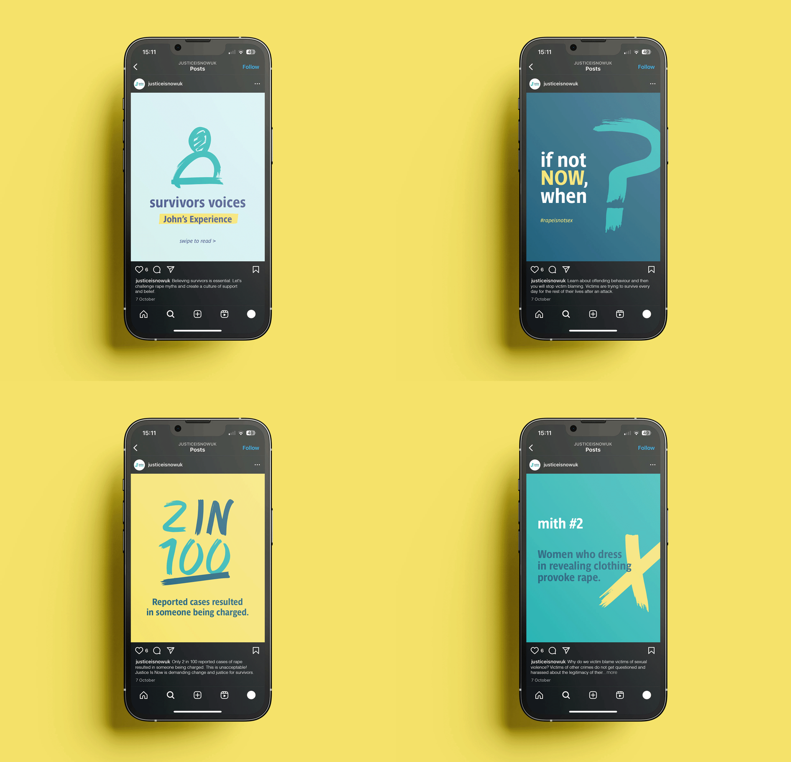
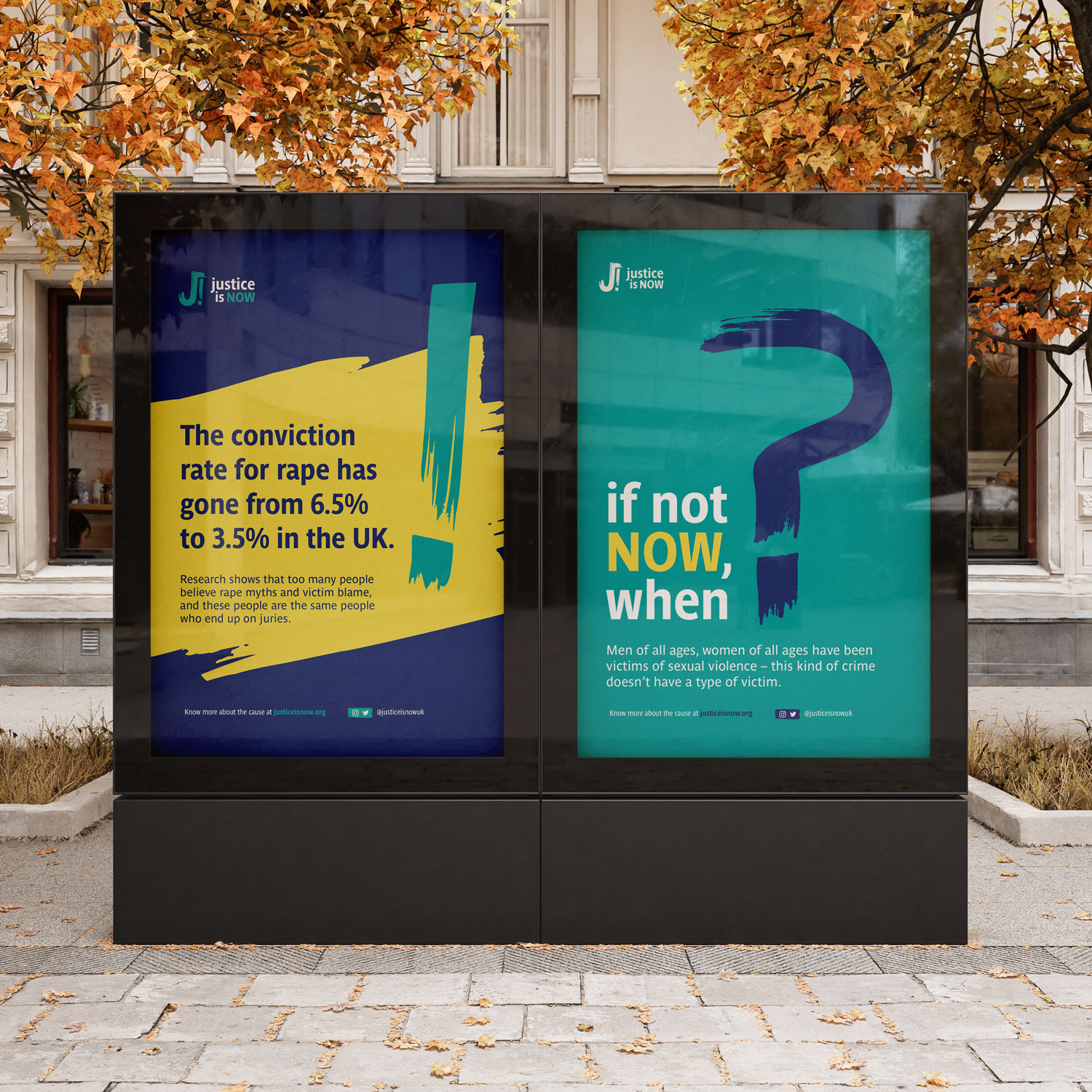
The conviction rate for rape has gone from 6.5% to 3.5% in the UK. Research shows that too many people believe rape myths and victim blame, and these people are the same people who end up on juries.

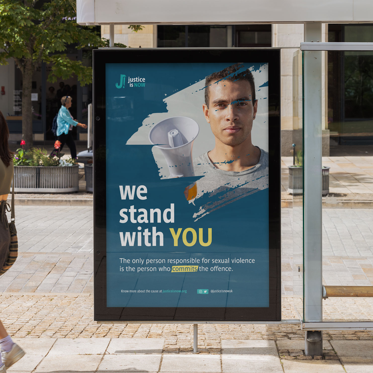
The only person responsible for sexual violence is the person who commits the offense.

Our goal is to create a world where justice for victims of sexual violence is not the exception but the norm.

We intend to get there by:

  • Advocate for a change in the treatment of rape victims in UK criminal courts and an end to rape myths used in society.
  • Challenge victim blaming and sexual violence myths.
  • Highlight cases of reporting in the media which victim blame.
  • Lobby for mandatory training for juries hearing crimes involving sexual violence.
  • Campaign for an end to defense barristers using victim-blaming myths during cross-examination.

concept

We focused on creating visuals that pass on a strong sense of urgency, aligning with the core goals of the organization: speaking up, protesting, and raising awareness through powerful voices.

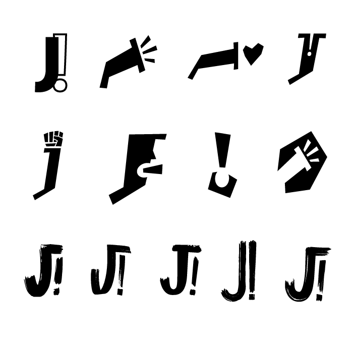
To convey this message, we explored protest symbols like exclamation points, megaphones, raised fists, and a mix of undercase and capitalized words to create visual contrast and emphasize strength and conviction.

solution

Inspired by the handwritten signs often seen at protests, we embraced this raw, expressive aesthetic to reflect the movement’s authenticity and passion.

To reinforce the message, we incorporated expressive symbols like the exclamation point (!) into the logomark, effectively conveying urgency, authority, and the assertiveness of our shared beliefs.

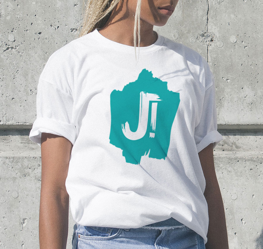
The brush stroke style gives the logo an expressive yet accessible look, making it easy for anyone to draw it on a sign, t-shirt, or flag and show support for the cause.
 

outcome

With the new brand identity, JIN now has a strong and cohesive visual representation that will help them effectively communicate their cause to the public. The new logo concept, with its brush stroke style and expressive yet accessible look, serves as a symbol of resistance and protest.

The new assets will be a powerful tool for JIN to spread its message and inspire more people to join its cause.

curious to know if I can help you?

let’s find out

canopie

app and digital program addressed to parental mental health (for expecting and new parents)
deliverable

illustration

client

Canopie

location

montreal, canada

overview

Ann & Anne support expecting women and new mothers through common motherhood challenges.

Together, they launched Canopie—a free, evidence-based app designed to improve maternal mental health and address the significant gap in care. Canopie provides clinically effective, flexible care through short, personalized audio programs that offer a humanizing approach to maternal wellness.

Our goal is to create effective, compassionate care for new moms. This means rethinking prenatal and postpartum care to fully address mothers’ emotional health.

It’s about caring for every mom, no matter where she is or her access to resources—high-quality care for everyone.

We’re offering a maternal mental health solution that’s impactful because it reaches moms at scale, right in their homes, at their convenience—especially during a time when traveling or scheduling isn’t an option. It’s critical, as 85% of new moms struggling with anxiety and depression aren’t receiving the treatment they need.

– Ann & Anne

concept

The name “Canopie” is inspired by the idea of a “canopy” that provides warmth, strength, and resilience, creating a sense of protection and support as mothers grow through their journey.

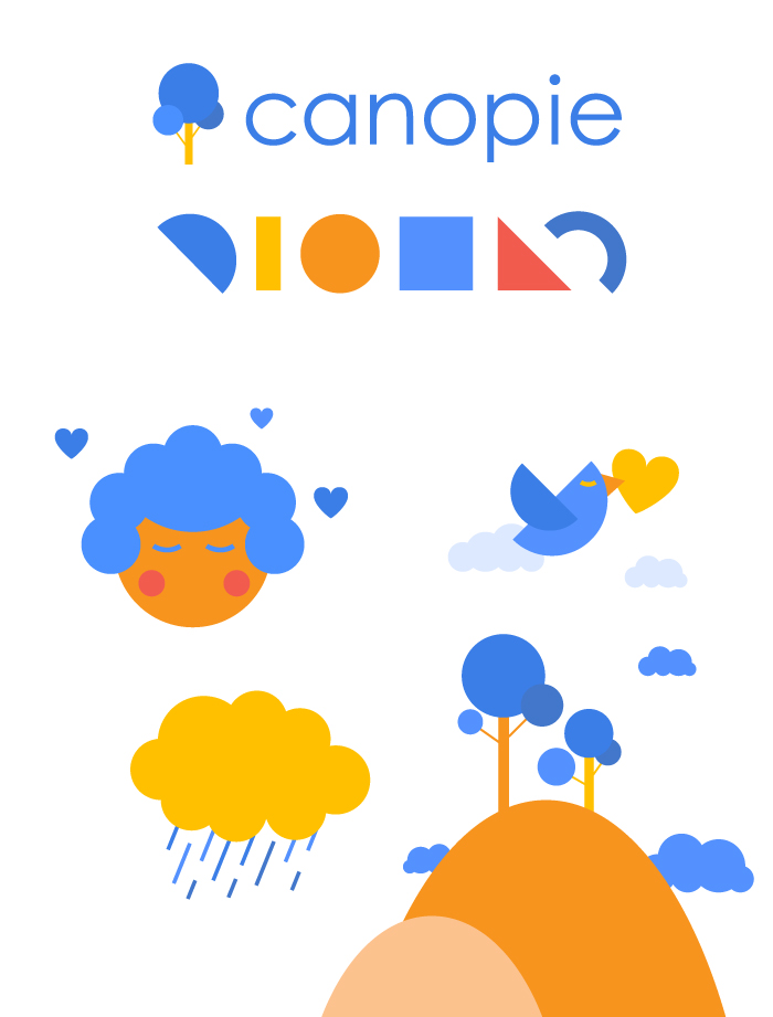
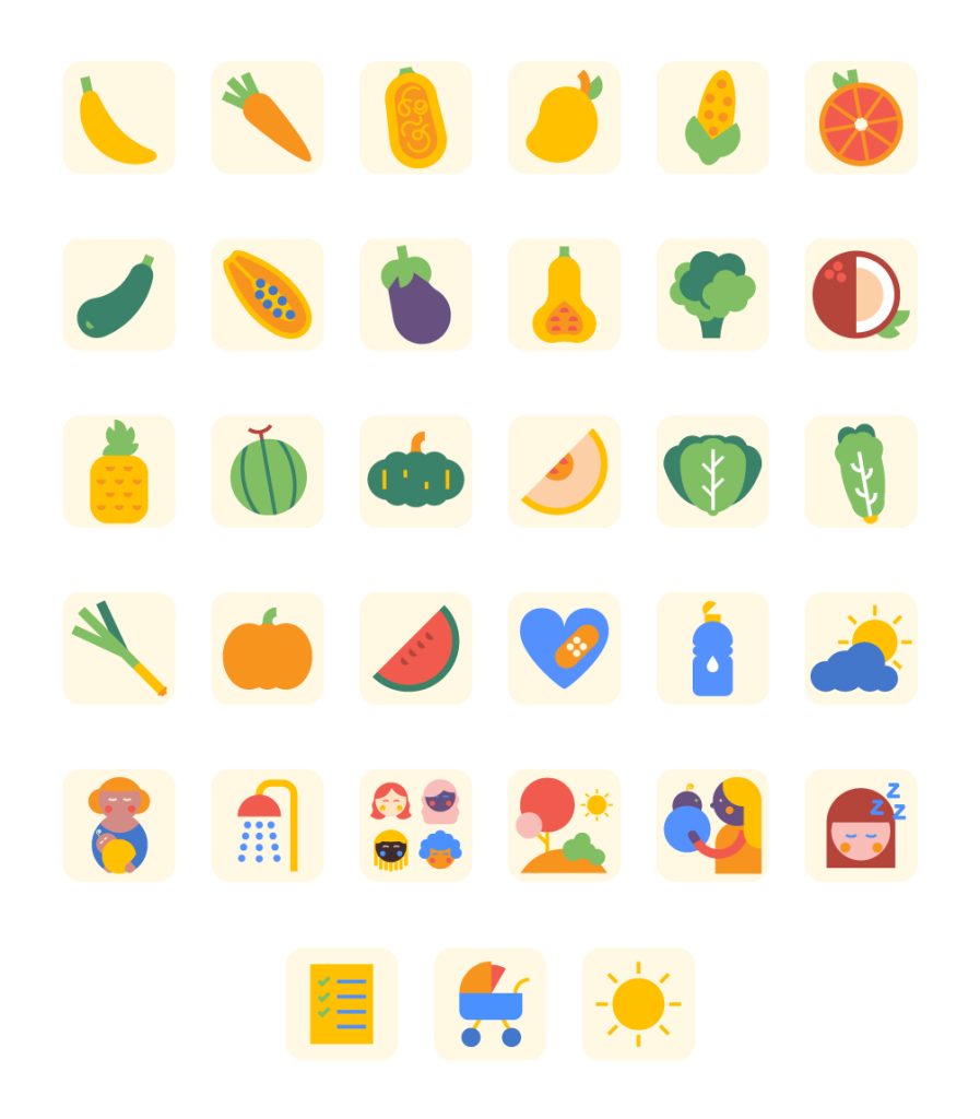
We expanded the logo’s aesthetic into a series of nature-inspired illustrations, emphasizing growth and transformation in a calm, nurturing environment – all of them are drawn with a limited number of geometric shapes, giving us unlimited composition options.

solution

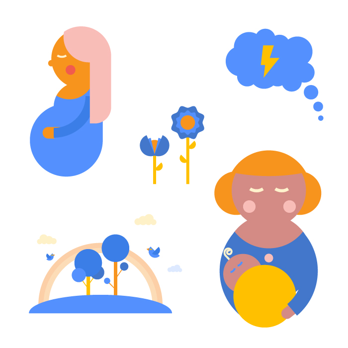
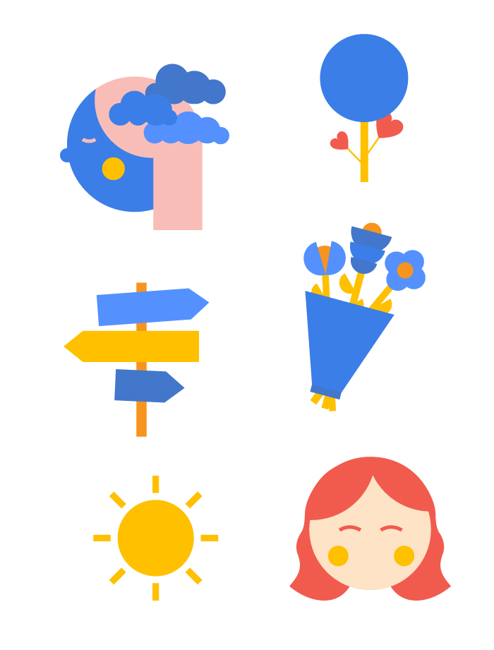
Natural elements like birds, flowers, and mountains were chosen to evoke freedom, lightness, and calm, coming together like a peaceful landscape.

We also included mama and baby characters with restful expressions to emphasize the desired mood and human connection.

outcome

When we met, Canopie’s visuals didn’t fully convey the message or energy it deserved. Lacking graphic cohesion, the visuals were created in-house using clipart-based images without structure or visual thinking.

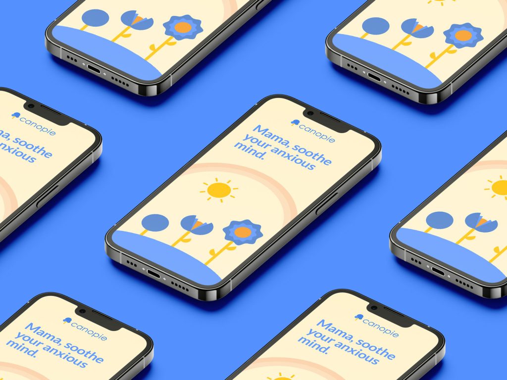
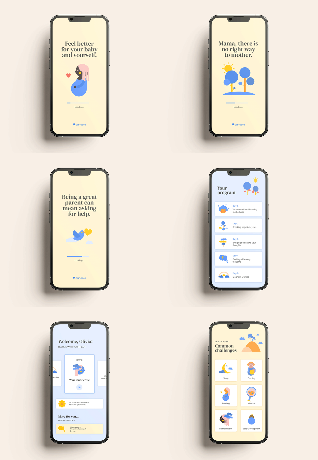
Now, Ann & Anne have a refined app interface featuring cohesive, on-brand illustrations that radiate the right energy. Each element is thoughtfully arranged, creating an enjoyable and intuitive user experience.

happy clients say

We absolutely loved working with Patrícia! 
She was flexible, open to feedback, produced lovely, high-quality work.
She was great, and we can’t wait to keep working with her!
 
Anne & Ann

curious to know if I can help you?

let’s find out

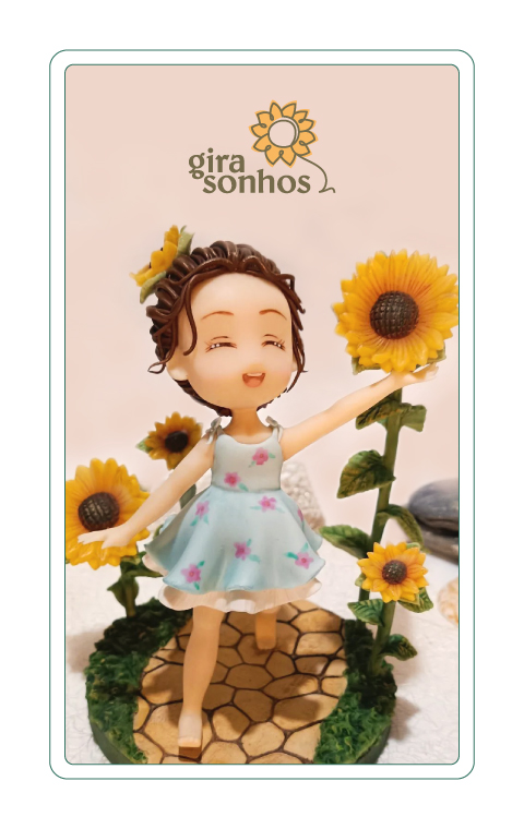
gira sonhos

unique, artistic and meaningful handmade gifts - for special moments and stages of life
deliverable

brand identity

client

Sandra Malho

location

lisbon, portugal

overview

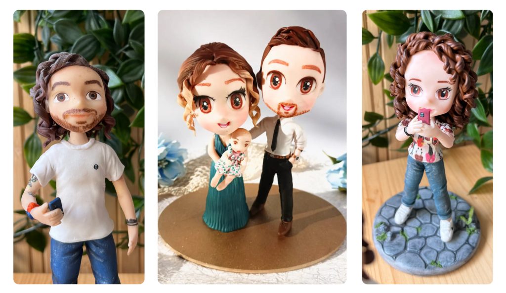
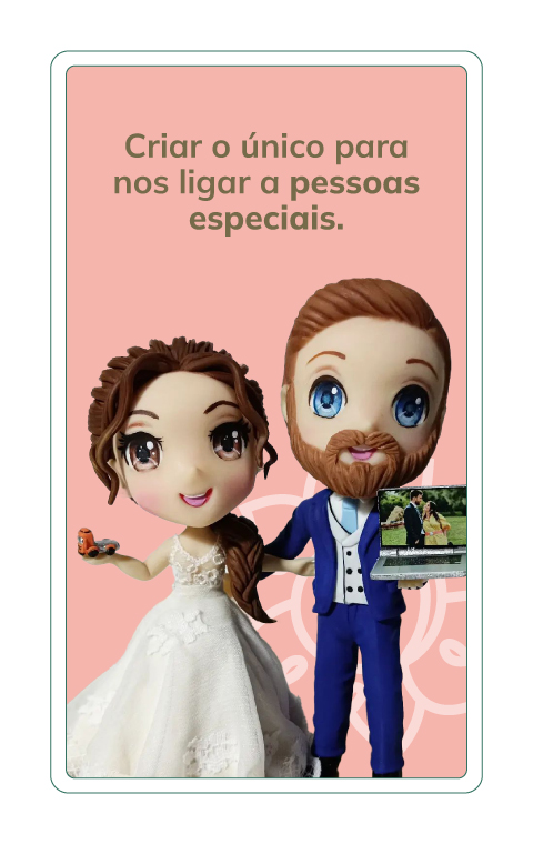
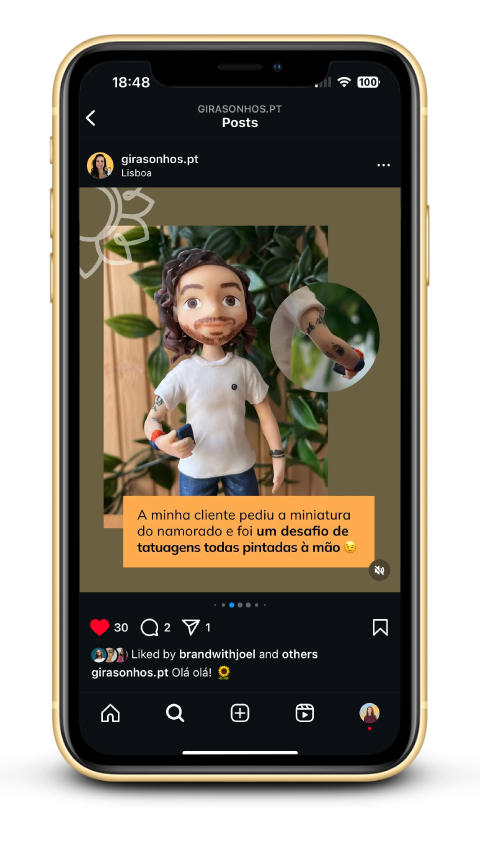
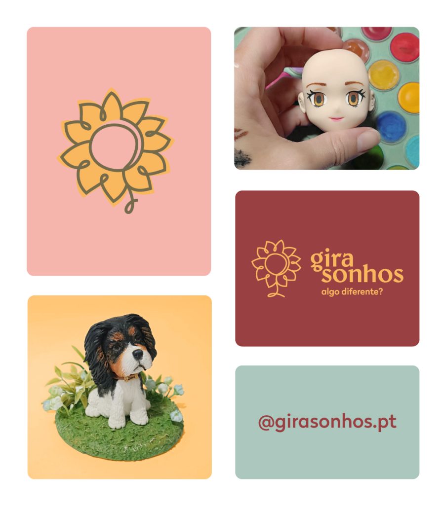
Sandra is a local talented artist and friend, who crafts beautiful personalized figurines. She’s been running her business for some time, and felt ready to take it to the next level. Unsure of how to improve her online presence and knowing it was affecting her sales, she reached out to Joel and me for help with brand strategy and visual identity. And we were THRILLED to get started!

Gira Sonhos is dedicated to the important people in our lives — those we should cherish most.

It helps people to give with intention, putting an end to unnecessary gifts and empty gestures. While combating unconscious consumerism, Gira Sonhos gives us the chance to show genuine appreciation.

As a person who has difficulty expressing what goes in my soul, art is my way of saying “I like you”, “you’re important to me” or even a simple “thank you”.

I like to offer something that makes the other person feel special and loved.

Something different.

– Sandra Malho

concept

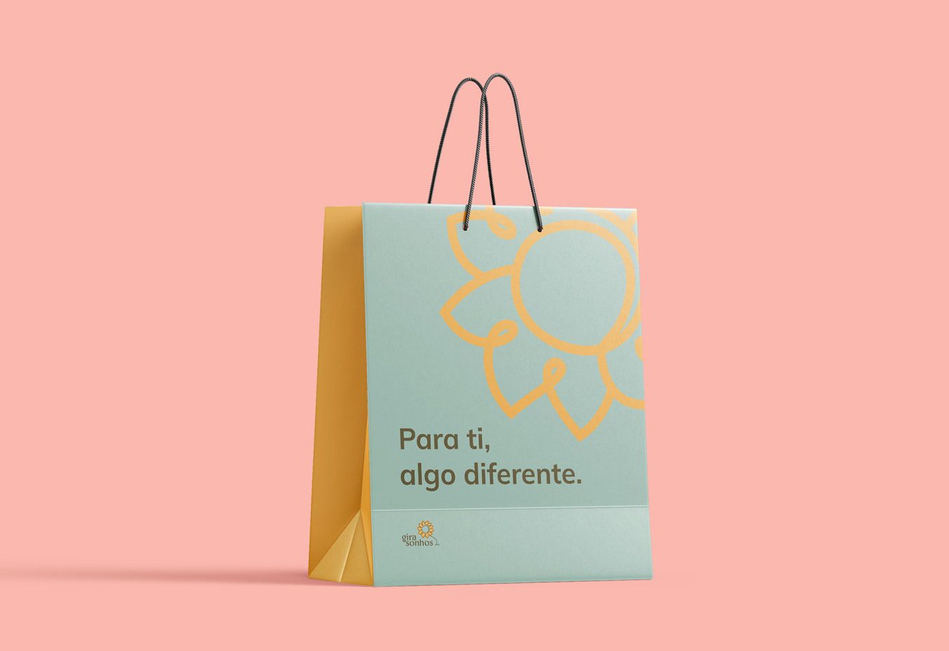
The name Gira Sonhos is inspired by two Portuguese words: girassol (sunflower) and sonhos (dreams).

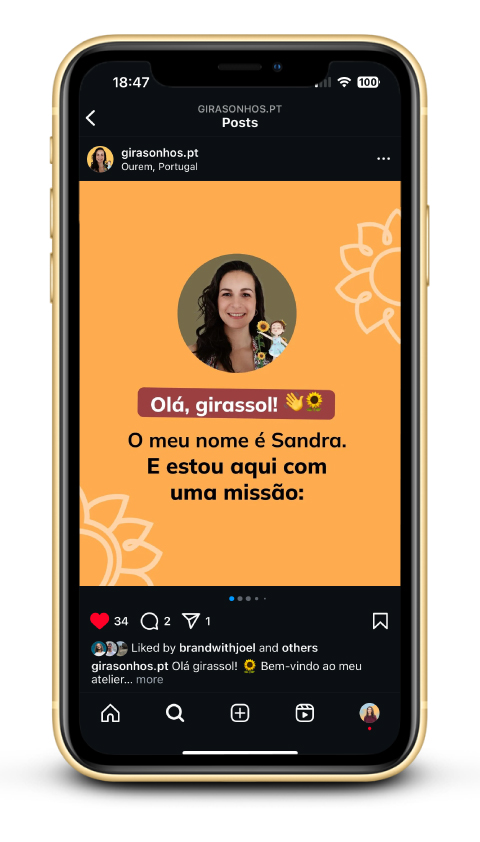
Sandra feels a deep connection with sunflowers and wanted this to be part of her brand identity. Since this is a personal project, it only made sense to reflect Sandra’s personality and ethic values in the design.

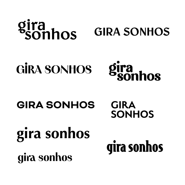
In the draft phase, we explored several sunflower variations, as well as typography that would align with Sandra’s vision.

Key attributes we highlighted:

  • Calmness
  • Friendliness
  • Emotion
  • Family
  • Altruism
  • Honesty

solution

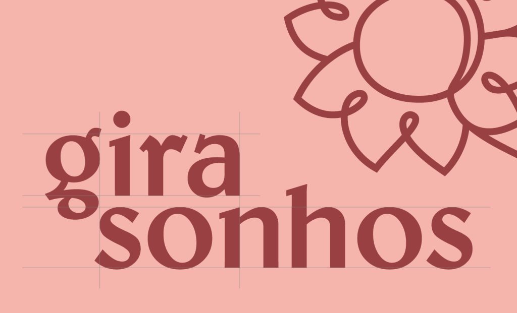
The logomark features a hand-drawn sunflower, symbolizing the artisanal and handcrafted techniques Sandra uses in her figurines.

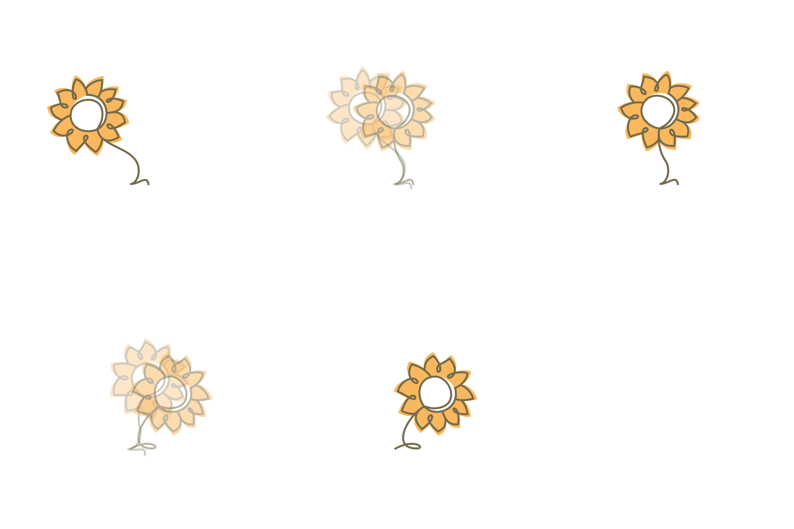
To highlight the sunflower’s unique characteristic—its natural tendency to turn toward the sun—we created multiple logo iterations, each showing the sunflower in a different position, as if it were following its light.

outcome

Thanks to the Brand DNA and brand identity process, Sandra now understands her audience, competitors, and how she wants to be perceived.

She’s confident in her online presence, knowing exactly what to post, how to post it, and how to use these tools strategically. With a brand identity that reflects who she is and connects with the right audience, she’s growing her presence effectively — and with real results, including orders from abroad within 2 months after launch.

know the project: @girasonhos.pt

curious to know if I can help you?

let’s find out

view from 32

advisory firm focused on beauty industry
deliverable

brand identity

client

view from 32 firm

location

los angeles, usa

overview

View From 32 was founded by Gabriella, Cassie, and Lindsay — three women with a passion for beauty. With a strong industry background from their time at Sephora’s headquarters in San Francisco, they bring both expertise and friendship into their work.

Their services include strategy, consulting, and expert advice to help beauty brands achieve their business goals. As thought partners, they guide clients through the competitive beauty market, empowering them to succeed.

A bit of their story:

A nod to the famed 32nd floor of the iconic retailer that gave the trio an unparalleled perspective of the industry as well as access to some of its most important leaders, executives, founders, investors and creatives, the name View from 32 pays homage to their combined time of over 25 years at Sephora.

It wasn’t until a summer trip to Portugal in 2022 when Cassie, Gaby and Lindsay officially decided to join forces and continue to steer brands towards success—this time, as a powerhouse of three. Over verdejos at the beach, they toasted to friendship, passion and continuing to leave their mark on the beauty industry as View from 32.

concept

When we started working together, their vision was to create a logo mark that combined elements of beauty products and a building, symbolizing their origin story.

While buildings are often associated with construction companies, real estate agencies, or architecture firms, we wanted to challenge that convention. How intriguing would it be to design a construction-inspired logo with a chic and feminine touch?

  • beauty + construction crossover
  • chic contractor vibe
  • 3 blocks (3 members) combined into a tall a structure
  • 32 implemented in the name

solution

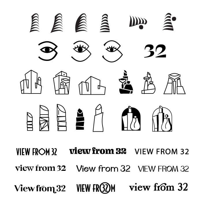
After exploring various drafts, we ultimately decided to take a different direction, opting for a modern, feminine eye shape inspired by Greek motifs, which directly ties into the company name.

The chosen typography is bold yet chic, reminiscent of boutique brands and contemporary, welcoming hotels.

This eye shape is simple and elegant, effectively conveying the concept of ‘view,’ while the typography adds a professional yet stylish touch, making the logo both visually impactful and memorable.

outcome

View From 32 now boasts a cohesive and distinctive brand identity that perfectly reflects its core message and personality. The logo’s modern, feminine, and chic elements, along with the premium color palette, seamlessly embody the tailored, high-end experience the brand offers each client.
 

curious to know if I can help you?

let’s find out

eggshells

science-based online mental health program
deliverable

illustration

client

Ann Don Bosco

location

london, uk

overview

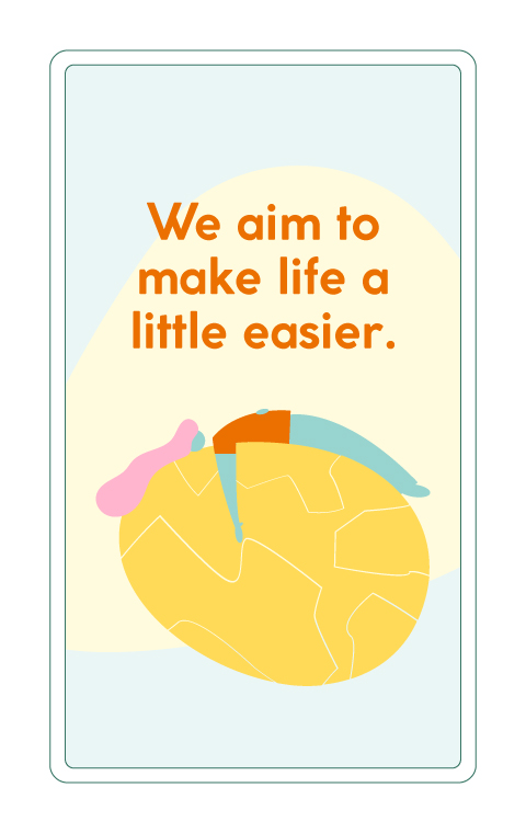
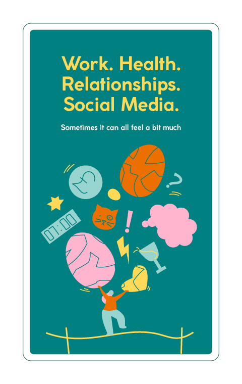
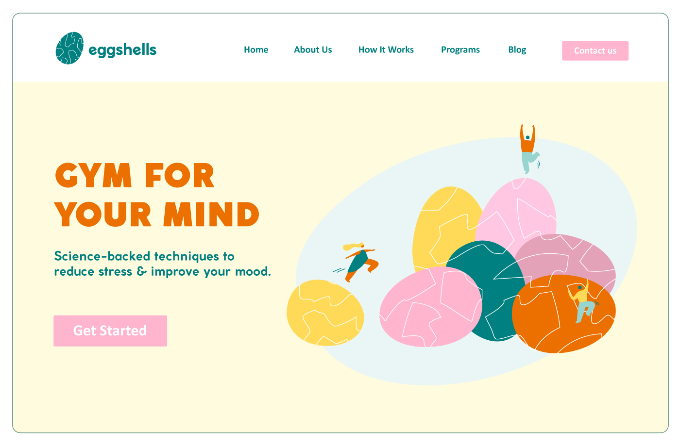
Eggshells is an online platform providing evidence-based mental health support outside of crisis situations.
 
Unlike our approach to physical health, where we go to the gym and only see a doctor for emergencies, mental health often offers only one option: seeing a doctor. Eggshells aims to change that by offering a “gym for the mind” experience. 

Usually people wait until they are ‘bad enough’ to get support but we believe that almost everyone could benefit from learning evidence based mental health techniques

What we’re doing as a brand is also really trying to normalise mental health challenges and tackle stigma. We know stigma is one of the reasons people don’t access support so it feels really important to do.
 
Ann Don Bosco – Founder

concept

The name “Eggshells” symbolises breaking free from the constraints of walking on eggshells, encouraging open conversation about feelings while maintaining a lighthearted tone.

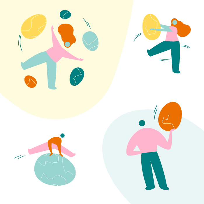
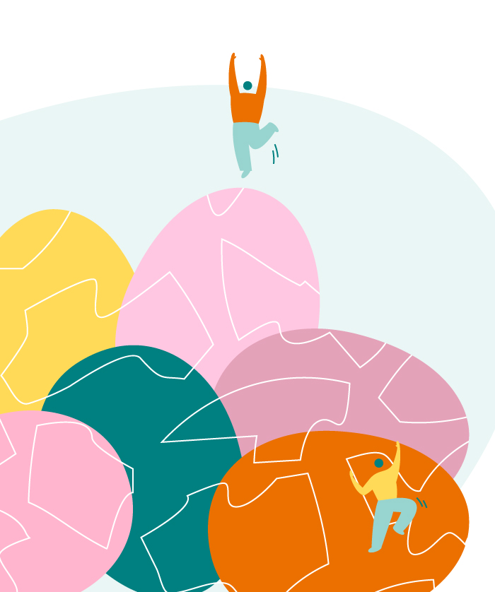
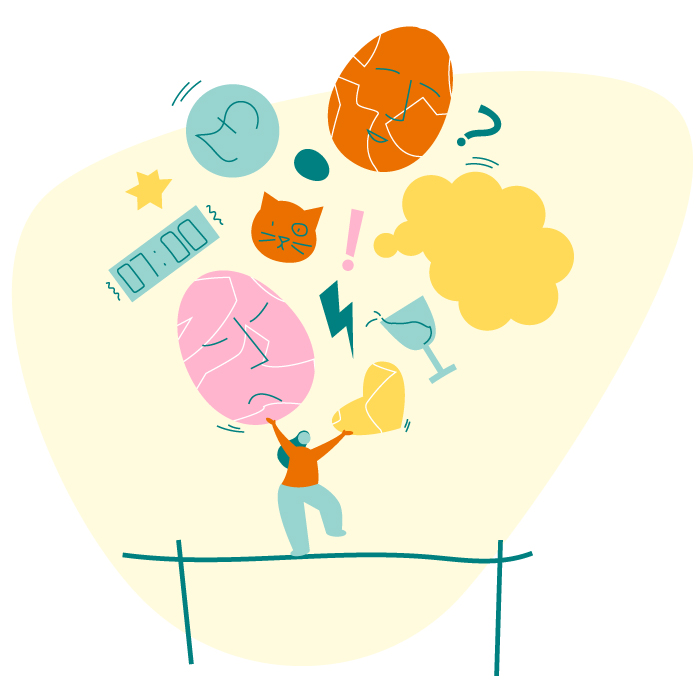
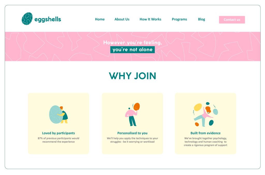
The illustrations feature the cracked egg as the main element, accompanied by simple human figures in various positions and interactions. These illustrations aim to convey the concept of acknowledging our feelings, accepting our mental state, and working on our mental health.

solution

The human figures are depicted hugging the eggs, juggling them, climbing on them, jumping over them, and examining them.

These actions symbolise the different ways we engage with our emotions and challenges. The size variations of the eggs, with some smaller than the human figures and others larger, represent the varying sizes and complexities of our personal issues.

By embracing our vulnerabilities and actively working towards improvement, we can foster a positive and supportive approach to our mental health journey.

We decided to tweak their logo to match the illustrations’ look and feel. 

outcome

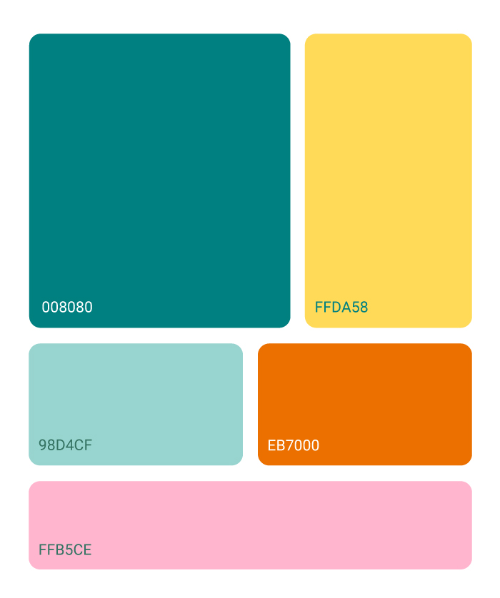
By incorporating these brand elements throughout the communication mediums, they effectively communicate the vision of Eggshells. They show an inclusive space where visitors can embrace their vulnerabilities, work on their mental health, and find inspiration for their journeys.
Overall, the brand identity and illustrations reinforce the message that it’s okay to show our vulnerabilities, and by doing so, anyone can actively improve their mental well-being.
 

curious to know if I can help you?

let’s find out

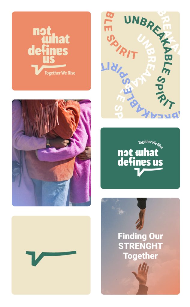
not what defines us

online support community for victims of sexual assault
deliverable

brand identity

client

Patricia DePietto

location

new york, usa

overview

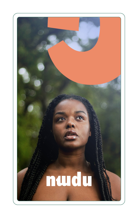
Patricia reached out for help with launching her latest project. Her website had valuable content but lacked a cohesive visual identity, relying too much on default platform graphics. After discussing her goals, we collaborated to create a custom visual identity for NWDU that aligned with her brand and resonated with the target audience.

At the heart of Not What Defines Us is a commitment to empowering survivors to heal, grow, and reclaim control over their lives. We recognize the strength within every survivor and believe that sharing experiences and insights can be a powerful catalyst for healing.

Our mission is to foster a community where survivors feel understood, supported, and equipped with the knowledge needed to navigate their healing journey.
 
Patricia DePietto – Founder

concept

We decided to focus on the Healing Journey and Breaking Stigmas by visually deconstruct the concept of being “defined” by past experiences and celebrate the diversity and resilience of survivors.
 
The goal is to convey a sense of empowerment, highlighting the idea that survivors are not shaped by what happened to them and are free to build their lives as they wish. 
 
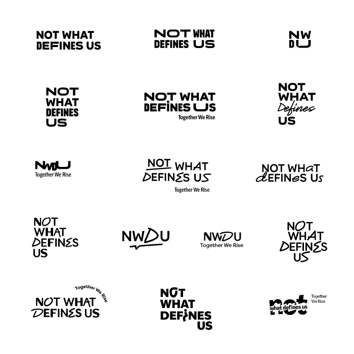
During the exploration phase, we tested some ideas such as:
 
• playing with different letter widths
• break the name in unexpected ways
• play with the idea of path
• use of bold typography

solution

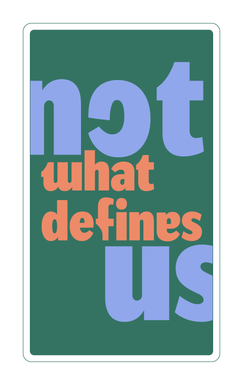
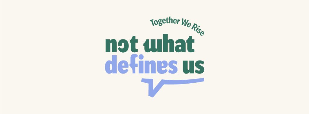
Some letters have a twist: the O is a C, the W is an M, the F is a T, the E is an A;
 

By manipulating the letters, we challenge the status quo, showing that no one is defined by convention, but by conviction; Just as the letters in the logo can be rearranged and transformed, survivors have the power to redefine their own narratives;

The bubble speech reinforces the idea of creating a safe space to share experiences and have their voices heard, as well as the importance of open communication and dialogue within the community;

outcome

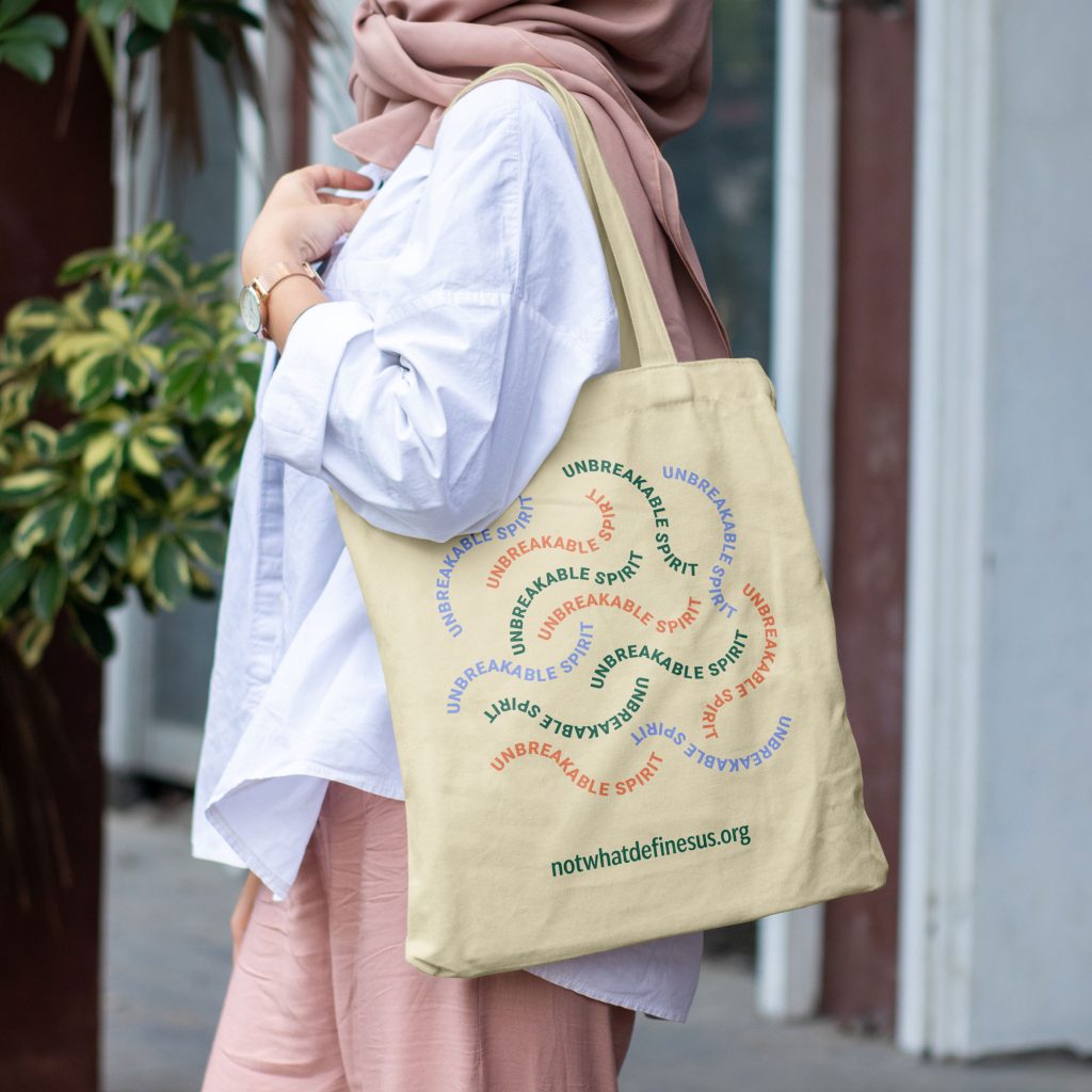
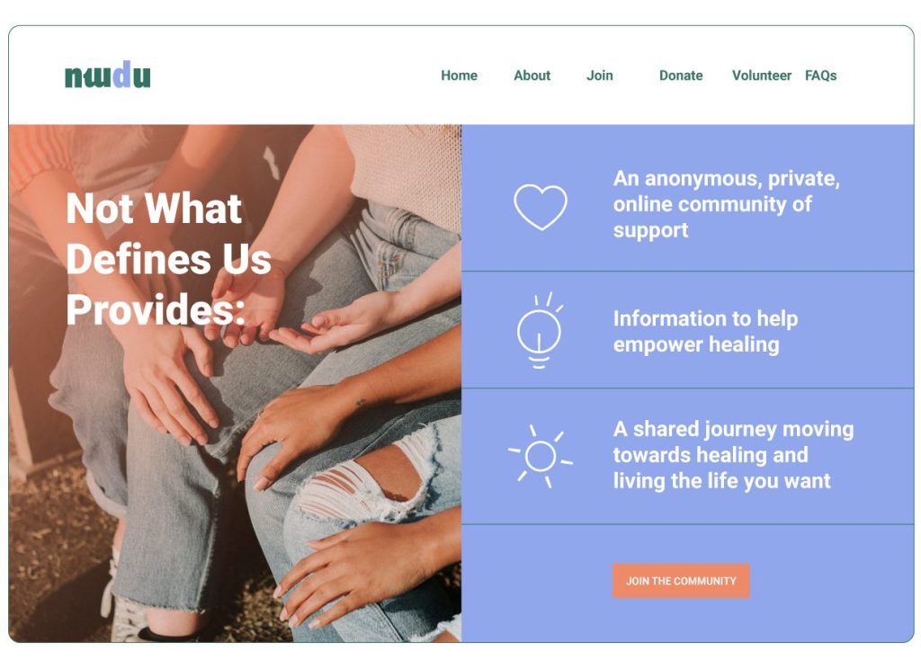
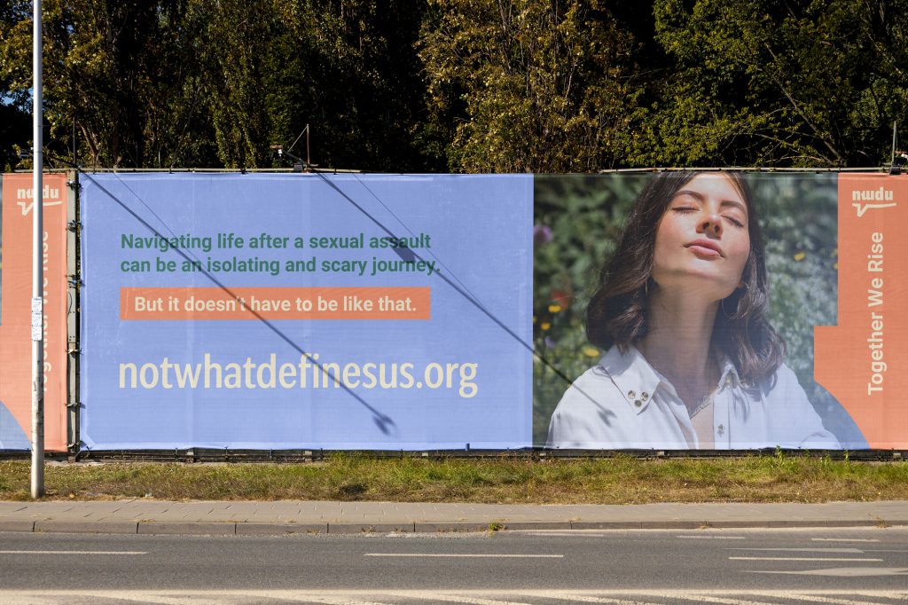
NWDU now holds a custom, thoughtfully designed visual identity that makes a strong impact and resonates with the desired audience. This cohesive identity enhances all brand touchpoints, allowing recognition and trust: the website and social media platforms consistently utilize these elements and colors, ensuring a unified and memorable brand presence.
 
Know more about the project at:

happy clients say

“Patricia was amazing to work with, she really cared about the project, had great ideas and went above and beyond to make the deliverable awesome. I would recommend and I will rehire in the future!”
 
Patricia DePietto

curious to know if I can help you?

let’s find out

Byting Chipmunk

Branding & Brand Design — GrowingDesign © 2023

Byting Chipmunk is a software management business that helps businesses transition to automated software delivery, ensuring effective processes and better results.
When Russell reached out…
“Late last year I was increasingly aware that I needed help with marketing as this was an area of business that I had not been exposed to previously in my career, and I wanted help to be more purposeful about how I was using social media. Fortunately I came across Joel’s activity on LinkedIn and decided to make contact.”
Russell is a veteran in his industry, now that he was flying solo he needed to grow an online presence that matched his expertise.
Take a bite out of your development time.
Byting Chipmunk’s mission
To provide software integration and delivery automation services to businesses and to supply industry peers with resources, and off-the-shelf tooling that will make their work easier.

Byting Chipmunk's brand values

Integrity and empathy
Byting Chipmunk knows how to put itself on the other side of table to have a full grasp of any situation.
Proactivity and resourcefulness
With DevOps we’re anticipating future problems and eliminating unnecessary errors. To implement DevOps is to be proactive.
Commitment
Software development is a very technical and demanding industry, to be committed to achieve a desired result, each step of the way, is highly expected and valued.
Collaboration
Byting Chipmunk provides and values a collaborative experience all throughout.
Collaboration. Automation. Efficiency.
After the brand strategy phase:

When we were happy with our findings, we moved on to the first step of my design process, the brand’s mood board. Both Russell and I brought visual references out of our own research and point of view.

After those discoveries and an in-depth brainstorming session, I presented Russell my solution.

Logo family

Typography

Color palette

We chose two main colors (the red and orange), two secondary colors (the purple and pastel color), and one accent color for support when needed (soft grey). The palette can be used as is, or in gradients as long, as we keep the color hierarchy to maintain the visual consistency throughout.

Now that we had the brand’s visual identity key elements…
Brand strategy is step 01, designing the brand’s visual identity is step 02. And step 03 is putting everything into action.

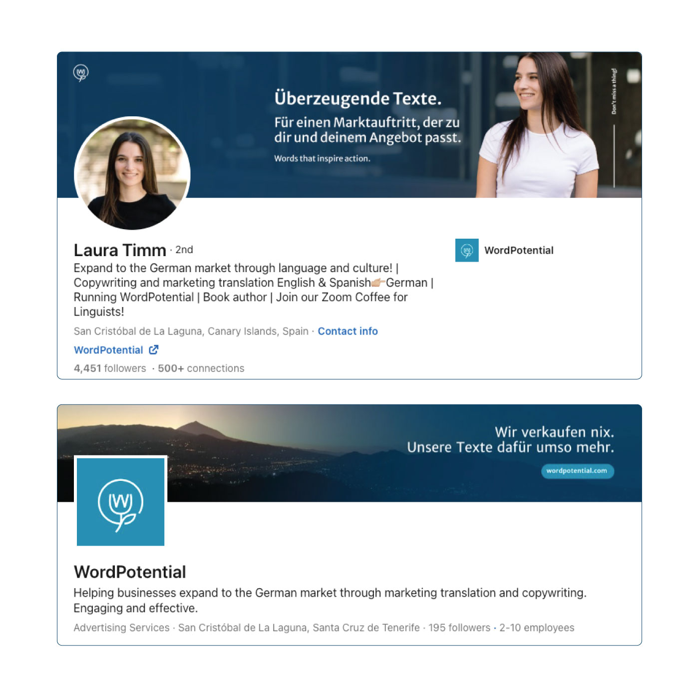
Now, we were now ready to re-write and re-design Russell’s most important touchpoint, his LinkedIn profile.

“Joel and I worked through his branding exercises which help me understand what I was trying to achieve as a business, who my prospective customers are and how my visual identity could align with those things. ”

– Russell Smiley, Byting Chipmunk

Russell's LinkedIn profile & company page

To redesign his LinkedIn profile and company page we of course used his new brand identity. The new logo, color palette, typography, and messaging bring his brand to life in a way that stands out against other competitors.

Social media post templates

With his new LinkedIn profile, Russell got a set of social media post templates built in his Canva account. The total collection extended to 15+ templates.

Slide deck template

Russell also got a slide deck template, built in Canva, to be used for different purposes. From pitch decks, to workflows and presentations.
And the final piece:
We wrapped up Russels’s Branded to Life project with a unique brand guidelines book.
This book ensures every branding effort stays on track, and gets Russell the results she’s looking for.

Brand guidelines book

This document is not only for the brand and business owner but also for anyone that will create any future marketing material while ensuring everything stays consistent.

GrowingDesign © 2023

WordPotential

Branding & Brand Design — GrowingDesign © 2023

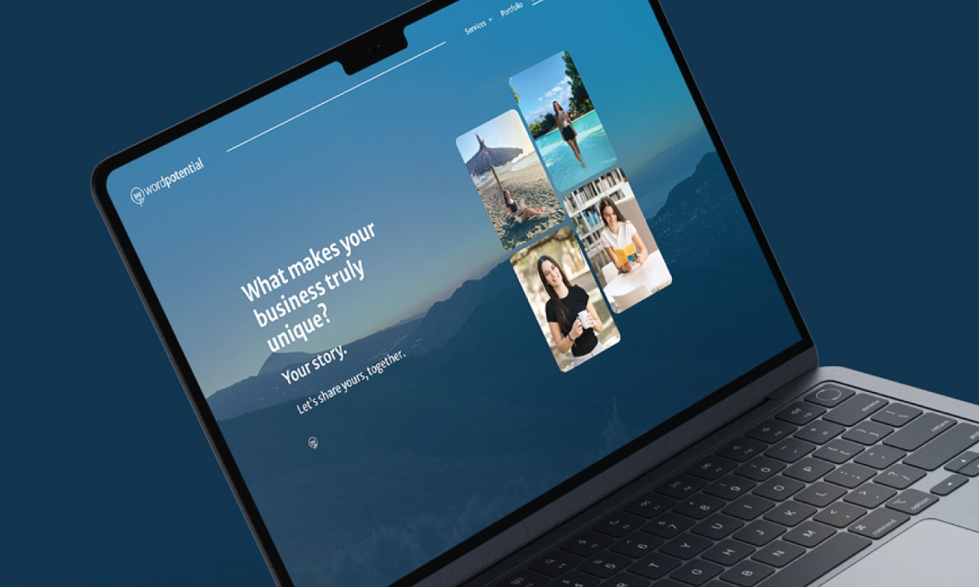
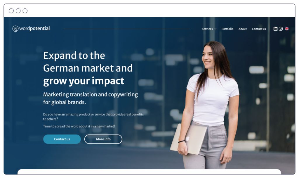
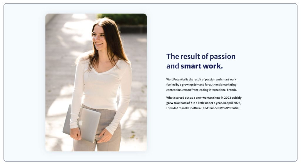
WordPotential is a marketing translation and copywriting team for brands who want to expand to the German market, and grow in the online space.
When Laura reached out…
“Initially, I contacted Joel for a re-do of my LinkedIn profile to reach more clients for my translation and copywriting business. After our first call, I decided to take the whole branding package.”
We realised that Laura needed to work on her brand and business foundations before investing in a new LinkedIn profile. And that’s what we did. Out of our first phase, WordPotential was born.
Copy with a cultural twist.
WordPotential’s mission
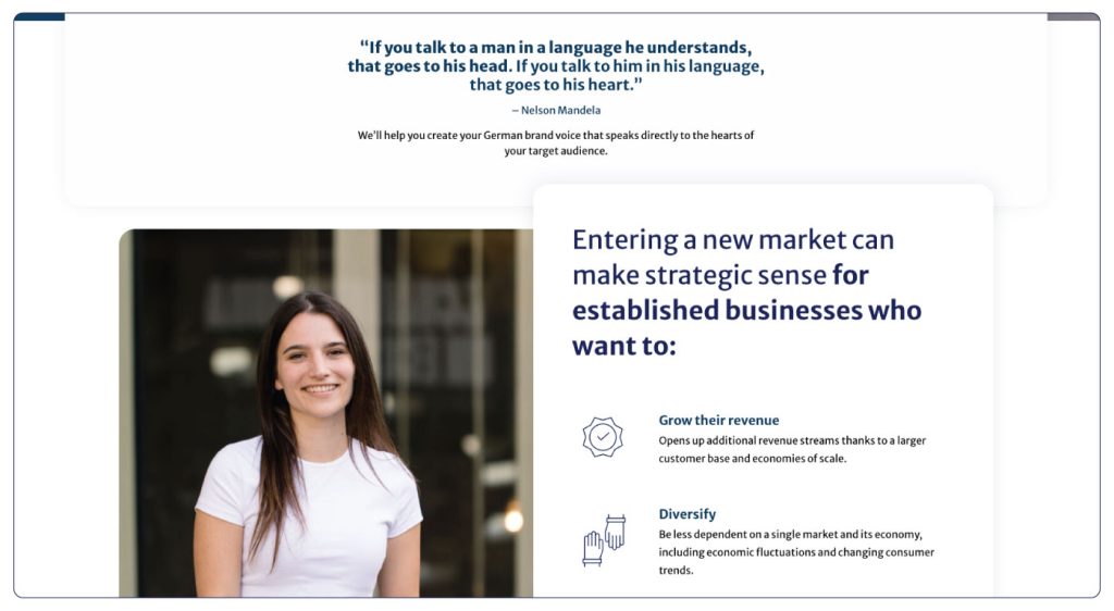
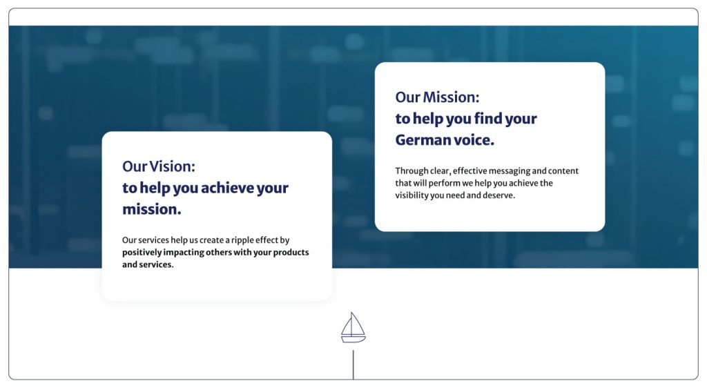
WordPotential will become the go-to partner for those who need to leverage the cultural and language nuances of the German market to stand out with their unique story, increase their brand awareness, and build strong relationships with their customers. To do so, Laura Timm and WordPotential will provide storytelling-infused marketing translation and copywriting services.

WordPotential's brand values

Time efficiency
Being respectful of one’s time and boundaries is an absolute must for Laura Timm.
Strong business mindset
Laura Timm values individuals who have strong beliefs, attitudes, and habits that lead us to business success.
Greater good
Laura Timm values people who not only pursue a better life for themselves, but also want to have an impact in the live of others.
Ambition
Being an ambitious person herself, Laura Timm values people who are lifelong learners and success seekers.
Words that inspire action.
After the brand strategy phase:
When we were happy with our findings, we moved on to the first step of my design process, the brand’s mood board. Both Laura and I brought visual references out of our own research and point of view.

After those discoveries and an in-depth brainstorming session, I presented Laura my solution.

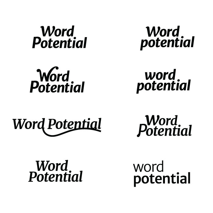
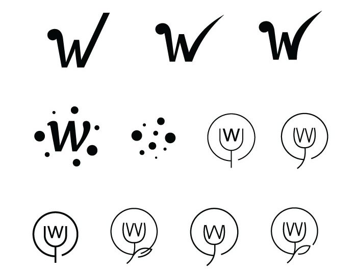
Logo family

Typography

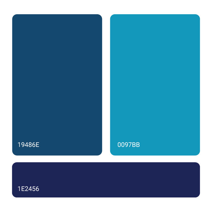
Color palette

We chose two main colors (the two blues), two secondary colors (the two pastel colors), and one accent color for support when needed (vibrant orange). The palette can be used as is, or in gradients as long, as we keep the color hierarchy to maintain the visual consistency throughout.
Now that we had the brand’s visual identity key elements…
Brand strategy is step 01, designing the brand’s visual identity is step 02. And step 03 is putting everything into action.
Now, we were now ready to re-write and re-design Laura’s most important touchpoint, her LinkedIn profile.
“The most transformative aspect of our collaboration was the purpose and direction that Joel helped me discover. I was able to identify what I wanted to do, how I could help others through WordPotential and how my business aligns with my personal life goals.”

– Laura Timm, WordPotential

Laura's LinkedIn profile & company page

To redesign her LinkedIn profile and company page we of course used her new brand identity. The new logo, color palette, typography, and messaging bring her brand to life in a way that stands out against other copywriters.

Social media post templates

Interactive slide deck portfolio

Laura also got an interactive slide deck to show WordPotential’s best work and easily land new clients. Because it’s interactive, it’s super easy to navigate through detailed case studies and present her team’s best offer to potential new clients.
And the final piece:
We wrapped up Laura’s Branded to Life project with a unique brand guidelines book.
This book ensures every branding effort stays on track, and gets Laura the results she’s looking for.

Brand guidelines book

This document is not only for the brand and business owner but also for anyone that will create any future marketing material while ensuring everything stays consistent.

GrowingDesign © 2023

Myrto Zehnder

Branding & Brand Design — GrowingDesign © 2023

Myrto Zehnder is an experienced fractional COO with a passion for transforming fintech and banking companies from within.
Before reaching out…
Myrto reached out looking for clarity and guidance on how to redesign her brand. She knows the importance of showing up online, and the importance of building a brand presence that stands out and resonates with her ideal clients.
With my framework, we worked on her brand foundations through brand strategy exercises, and defined key business concepts every brand should have before they show up to the world.
Leadership. Performance. Profit.
Myrto’s mission
Through her fractional COO services, based on her 360º experience in the field as an employee, CEO, investor, and board member, Myrto empowers CEOs and their organizations to optimize operations and build high-performance teams, all aimed at achieving professional fulfilment, increased profits and business growth.

Myrto's brand values

Adaptive and open-minded
Myrto values people who are willing to consider new perspectives and embrace change.
Hands-on and involved
Myrto has a hands-on approach, committed to make things happen and participate in her client’s success.
Trust and transparency
Trust and transparency are non-negotiable. Due to the nature of the work, a trustworthy relationship built on transparency is crucial.
Empathy and empowerment
Myrto creates safe and supportive spaces for both the CEOs and their teams to thrive and work to their full potential.
“First one in, last one out the office?”
After the brand strategy phase:
When we were happy with our findings, we moved on to the first step of my design process, the brand’s mood board. Both Myrto and I brought visual references out of our own research and point of view.

After those discoveries and an in-depth brainstorming session, I presented Myrto my solution.

Logo family

Typography

Color palette

We chose two main colors (the two purples), two secondary colors (blue and teal), and one accent color for support when needed (grey). The palette can be used as is, or in gradients as long, as we keep the color hierarchy to maintain the visual consistency throughout.
Now that we had the brand’s visual identity key elements…
Brand strategy is step 01, designing the brand’s visual identity is step 02. And step 03 is putting everything into action.
We were now ready to re-write and re-design Myrto’s most important touchpoint, her LinkedIn profile.

Why an eagle?


“Working with Joel on my brand, what stood out was my 360° detailed overview on the fintech and banking software business from various roles and different backgrounds.”

– Myrto Zehnder

Myrto's LinkedIn profile & company page

To redesign her LinkedIn profile and company page we of course used her new brand identity. The new logo, color palette, typography, and messaging bring her brand to life in a way that stands out against other fintech COOs.

Social media post templates

And the final piece:
We wrapped up Myrto’s Branded to Life project with a unique brand guidelines book.
This book ensures every branding effort stays on track, and gets Myrto the results she’s looking for.

Brand guidelines book

This document is not only for the brand and business owner but also for anyone that will create any future marketing material while ensuring everything stays consistent.

GrowingDesign © 2023

Go Boss Yourself

Illustration

~ intro ~
Joel is a brand identity & graphic designer passionate about helping businesses (re)create their brands the right way. 
He also helps frustrated creatives become confidently independent freelancers, and he wrote a book about it.
 
“Go Boss Yourself” is not your 0-to-10k a month bullshit eBook. It’s free, it’s awesome, and it shares a lot of random stuff you need to know right now.
 
Joel challenged me to create illustrations to go along with the content, which I happily accepted.
~ the problem ~
Every year 26,000,000 mamas experience maternal mental health conditions.
Anne & Ann are committed to reducing this number and helping as many women as possible.
 
Their purpose is amazing, but unfortunately, Canopie’s visuals didn’t translate the message or the energy it deserves. They had a lack of graphic cohesiveness, mostly because they were doing everything by themselves, using clipart-based images, without any structure, or the help of a professional designer.
 
After a consultation session, we agreed in setting a harmonious visual style and develop a group of illustrations that communicate the sense of stillness, comfort, and positiveness across all the sections of the app.
~ concept & solution ~
Based on the mood board, we established the basics for the illustration style:

Flat, geometric shapes combined with simple outlined elements. Human connection is very important to Joel, so we made sure to include human characters wherever they fit. We followed a monochromatic color palette, coherent with his personal brand feel – lots of blue.
~ the outcome ~
By combining this valuable written content with the illustrations we provide a better experience to the readers. We keep them engaged by breaking the flow with visual content.

GrowingDesign © 2014-2023

Justice Is Now!

Brand design

~ intro ~
Justice Is Now is a non-profit organization that aims to combat the use of rape myths as defense tactics in courtrooms and increase the conviction rate for rape cases. The organization was created in honor of sexual assault victims and aims to end the practice of victim blaming and educate the public about the realities of sexual assault. 

Their goal is to ensure that future victims do not have to endure the injustice of rape myths being used in court.
 
The conviction rate for rape has gone from 6.5% to 3.5% in the UK. Research shows that too many people believe rape myths and victim blame, and these people are the same people who end up on juries.
~ the problem ~
The brand communication of Justice Is Now relied on volunteers that didn’t had the knowledge and expertise of professional graphic designers or branding specialists. The assets they created were confusing, weak and didn’t properly communicate the organization’s message.
 
A strong brand identity is crucial for any organization, and it is especially important for a non-profit like Justice Is Now. A cohesive and impactful visual identity can help communicate the organization’s values and beliefs to the public, make it easier for them to achieve its goals and make it easier for the public to understand and support its mission.
~ concept & solution ~
logo
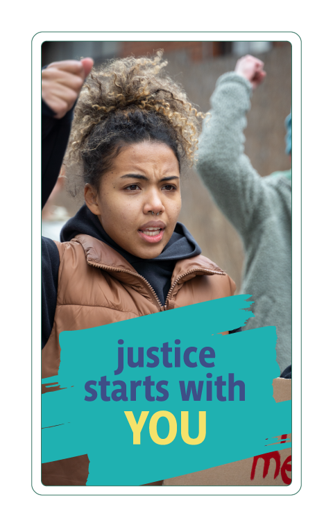
The concept is inspired by the brush-written signs used in protests. 
The brush stroke represents the freedom of speech and the right to express one’s thoughts and beliefs through different means.
 
The logo features a J and an exclamation point (!) merged into a single logomark. The brush stroke style gives the logo an expressive yet accessible look, making it easy for anyone to draw it on a sign, t-shirt, or flag and show support for the cause.
 
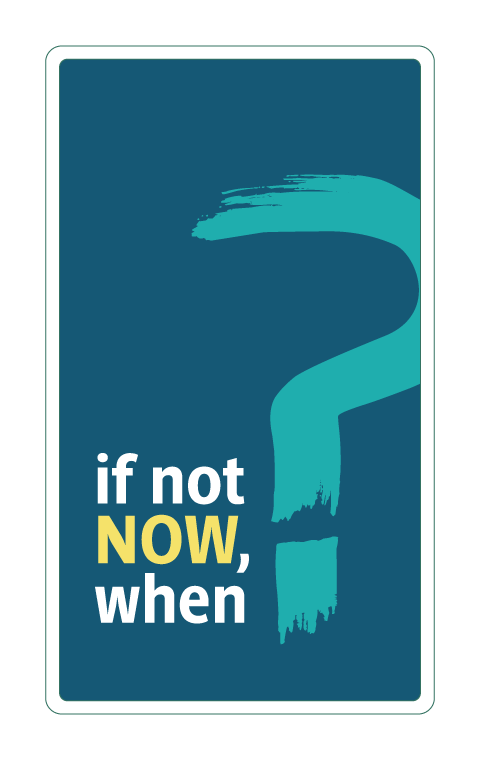
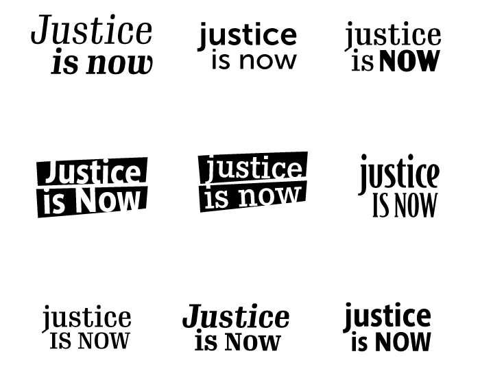
The exclamation point in the logo is intended to convey a sense of urgency and the need for change. The word “NOW” in the logo concept emphasizes the importance of taking action right now.
 
color palette
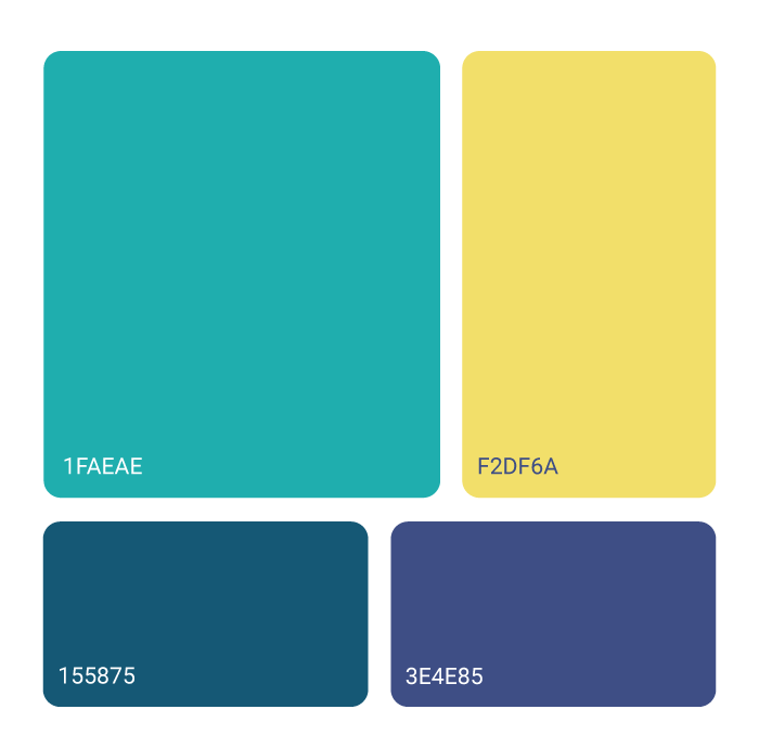
The color scheme is intended to be provocative and vibrant. These colors are meant to grab attention and help to make the communication assets more visible, with the goal of bringing more attention to the cause that the organization is defending.
 
The use of bright, bold colors is also intended to convey a sense of energy and urgency, which aligns with their overall message. 
~ the outcome ~
With the new brand identity, JIN now has a strong and cohesive visual representation that will help them effectively communicate their cause to the public. The new logo concept, with its brush stroke style and expressive yet accessible look, serves as a symbol of resistance and protest.

The new assets will be a powerful tool for JIN to spread its message and inspire more people to join its cause.
know more at:

GrowingDesign © 2014-2023

Canopie

Illustration

~ intro ~
Ann & Anne help expecting women and new moms deal with common motherhood challenges and feelings such as anxious thoughts, how to manage relationships, and dealing with feelings of shame.
 
They joined their talents together to create Canopie.
 
Canopie is a free app and an evidence-based digital program created to address maternal mental health conditions and close the enormous gap in care. It delivers clinically effective asynchronous care in humanizing, short, customized audio programs.
~ the problem ~
Every year 26,000,000 mamas experience maternal mental health conditions.
Anne & Ann are committed to reducing this number and helping as many women as possible.
 
Their purpose is amazing, but unfortunately, Canopie’s visuals didn’t translate the message or the energy it deserves. They had a lack of graphic cohesiveness, mostly because they were doing everything by themselves, using clipart-based images, without any structure, or the help of a professional designer.
 
After a consultation session, we agreed in setting a harmonious visual style and develop a group of illustrations that communicate the sense of stillness, comfort, and positiveness across all the sections of the app.
~ concept & solution ~
We based the illustration style on the aesthetic of their logo: flat, geometric, and vibrant colors.
 
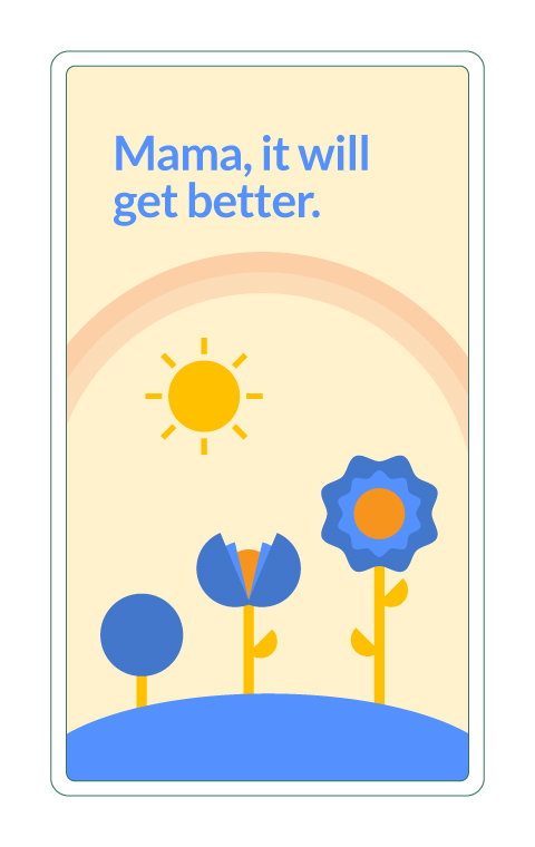
We selected natural elements such as birds, flowers, and mountains, as an association with the senses of freedom, lightness, and calmness. Like a beautiful landscape.


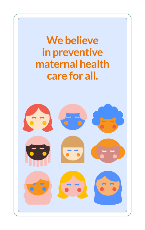
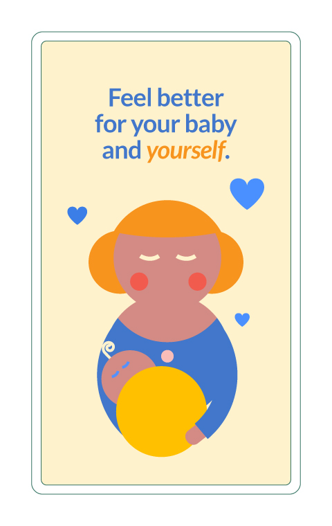
We also included mama and baby characters with restful expressions to emphasize the mood and human connection.

~ the outcome ~
As a final result, Ann & Anne now have a better app interface built with on-brand illustrations that transmit the right energy. All elements and sections are well arranged and have space to breathe, providing an enjoyable and intuitive user experience.

 know more about the app & project at:
canopie.app

GrowingDesign © 2014-2023

View from 32

Brand design

~ intro ~
View From 32 is a business founded by Gabriella, Cassie, and Lindsay – 3 women who are passionate about beauty.
They have a strong background in the industry, having been educated by Sephora and starting their friendship at the Sephora headquarters in San Francisco.
 
They offer a wide range of services, including strategy, consulting, and advice, to help beauty brands reach their business goals and empower them to succeed. They aim to be thought partners for their clients, helping them to navigate the competitive beauty market.
~ the problem ~
A strong brand identity is essential for any business because it allows the company to effectively communicate its values, beliefs, and personality to its audience. 
 
A cohesive and impactful visual identity, including elements such as a logo, color scheme, and typography, can help create a recognisable and memorable brand that stands out in the market. It also helps to build trust and credibility with the audience, and convey the unique value proposition of the business.

My task here was to help them get a custom brand identity.

Before starting to work on the visual aspects of the brand identity, it is important to have a clear understanding of the brand’s goals and style. A brand identity questionnaire has proved to be a useful tool to gather insights into the brand’s mission, values, target audience, and desired image. So that was our starting point.

~ concept & solution ~
logo
When we started working together, the initial idea was to create a logo mark that combined elements of beauty products and a building to symbolise their origin story. 
 
However, as we explored different drafts for the logo, we ultimately decided to go in a different direction and chose a modern and feminine Greek-like style eye shape that directly connected to the company name. 
 
The chosen typography is bold, feminine, and chic, reminiscent of the logos of boutique businesses and modern yet friendly hotels. 
 
This choice of eye shape, simple and elegant, communicates the concept of “view” and the typography conveys a professional and chic touch, making the logo visually impactful and memorable.
message of providing custom and unique maps for each client, just like their road trips.
 
The name “View From 32” has two meanings.
 
Firstly, it refers to the fact that the founders met at Sephora, which was located on the 32nd floor of a building in downtown San Francisco. This location played a significant role in the start of their friendship and their journey in the beauty industry. 
 
Secondly, the name also represents the perspective and understanding that working at Sephora has given them of the beauty landscape. Being on the 32nd floor allowed them to have a bird’s eye view of the industry and be ahead of trends, which they can now leverage to help other beauty brands.
color palette
The color palette contains two pairs of contrasting colors, green and pink and yellow and purple. The orange comes as a neutral color that goes with both combinations.
The tones are pastel but saturated, making them bold but still chic and exclusive. 
 
This color choice is meant to evoke a sense of luxury and elegance, while still being approachable and welcoming. The use of contrasting colors also helps to create visual interest and a sense of balance
 
Together, these colors convey a sense of luxury and exclusivity while also capturing the natural beauty of Ireland, aligning with the brand’s message of creating personalised and unique products.
~ the outcome ~
View from 32 now has a cohesive and unique brand identity that aligns with its core message and personality. The elements of the logo connect to the modern, feminine, and chic traits of the brand, as well as the premium color palette, aligning with the custom and unique experience provided to each client.

GrowingDesign © 2014-2023

Memories from Ireland

Brand design

~ intro ~
Keith is an Irish man who enjoys traveling across Ireland to relax and gain perspective. He shares his travel itineraries online to help others plan their trips and has started a project called “Memories from Ireland” where he creates custom digital maps based on people’s road trips.
 
The maps are designed to look hand-made watercolors, with paint brush stroke-style design and are printed on high-quality textured paper with premium paint. This gives the paintings a unique and authentic look, mimicking the traditional art of hand-drawn maps.
~ the problem ~
Keith had a logo that appeared cheap and unprofessional, contradicting the premium identity he wanted to establish for his brand. The logo was a detailed illustration with small text and too many details, making it difficult to recognize at smaller scales.

Additionally, there was no visual cohesiveness across his brand, meaning the elements used in the logo didn’t match the brand feel. These situations create confusion and dilute the brand’s message.

Before starting to work on the visual aspects of the brand identity, it is important to have a clear understanding of the brand’s goals and style. A brand identity questionnaire has proved to be a useful tool to gather insights into the brand’s mission, values, target audience, and desired image. So that was our starting point.

~ concept & solution ~
logo
The logomark concept is a shamrock, a symbol of Ireland, drawn in an organic and freehand style to give the impression of being hand-made. The strokes are designed to look as if they were made by a paintbrush, connecting to the aesthetic of the map and reinforcing the brand message of providing custom and unique maps for each client, just like their road trips.
 
The shamrock symbol is a simple, yet clear way to connect the brand to the Ireland and the organic, hand-made style of the logo gives it a personal touch. The use of paint brush strokes emphasises the brand’s attention to detail and the uniqueness of each client’s experience.
 

The typography selected has details reminiscent of the Celtic style, further emphasising the connection to Irish heritage and reinforcing the brand’s identity.

color palette
The color palette contains dark green, which represents the lush fields and beautiful landscapes of Ireland, gold, which is associated with premium brands and evokes the rich heritage of Ireland, and deep blue, which represents the ocean surrounding the island.
 
Together, these colors convey a sense of luxury and exclusivity while also capturing the natural beauty of Ireland, aligning with the brand’s message of creating personalised and unique products.
~ the outcome ~
Memories from Ireland now has a cohesive and unique brand identity that aligns with its core message and goals. The elements of the logo connect to Irish heritage and symbols, as well as the premium color palette, aligning with the custom and unique maps that Keith creates for each client. 
 
Overall, this brand identity effectively communicates the brand message and visually represents the personalised and high-quality products provided.

GrowingDesign © 2014-2023

Cosmic Creative

Brand design

Cosmic Creative is a digital copywriting service for businesses in the career, finance, and tech industries.
Rebecca, the founder, reached out looking for clarity and guidance about the built of her new brand. She knows the importance of showing up online, and the importance of building a brand that stands out and resonates with her ideal customers.

With the proper framework, we worked on her foundations, explored different ideas, and defined key business concepts every brand should have clarified before they show up in the world.

Real words. Real connections.
Mission

Cosmic Creative is dedicated to providing psychology-based copywriting services to business owners who are committed to building strong and long-lasting businesses who value integrity, respect and empathy.

Brand values

Ambition and Commitment
Cosmic Creative values professionals who are ambitious not only about their own business ventures but also about making a positive impact on the world.
Respect and Empathy

Mutual respect for one another and being able to see the world from someone else’s perspective is highly valued by Cosmic Creative. 

Openness
Cosmic Creative values safe and open spaces for productive discussions. Not only with clients, but online audiences as well.
Integrity
Cosmic Creative trusts their clients to stand by their values and is committed to doing the same. Building a strong reputation is one of Cosmic Creative’s goals.
Creative. Compelling. Cosmic.
“I know the importance of investing in myself. I also quickly realized that if I wanted my brand to stand out and resonate with my ideal customers, I needed some serious help.”

“He (Joel) helped me hone in on my vision and mission, took an in-depth look at my target audience (e.g. their biggest challenge, desires, and buying decisions), completed a competitive analysis, figured out what makes my brand unique, narrowed down my brand voice and values, and so much more.”

– Rebecca Scott, Cosmic Creative

Typography

Colors

Brand imagery

LinkedIn Profile

We’ve redesigned Rebecca’s main brand touchpoint, her LinkedIn profile.


With a new banner image, a unique profile picture and the right messaging throughout, Rebecca is getting new followers consistently.

Social Media Templates

We designed and prepared new social media post templates for Cosmic Creative. These templates are easy to use and fulfill the brand and business needs to build awareness and capture new leads.
Copy that is out of this world!
Thank you!

GrowingDesign © 2022

Dr. J. Rodríguez

Personal branding

Dr. J. is a master educator and recognized expert in message development for ethical team building, diverse leadership presence, and inclusive audience engagement.
Dr. J. reached out looking for clarity and guidance about the building of his own personal brand. He knows his strengths and the value of his work, but he also knew those features and benefits weren’t being communicated correctly.
With the proper framework, we took a step back, dug new foundations, explored new ideas, and defined key business concepts every brand should have clarified before they show up to the world.
Bee seen. Feel seen.
Mission
Make people feel seen, recognized, and that they belong through moments of solidarity and meaningful connection provided in the form of group and one-on-one teaching.

Brand values

Openness and honesty
Dr. J. is and requires his clients to be fully honest and open to change.
Courage
It takes courage to recognize we’re in a difficult situation, and then decided to do something about it.
Community and solidarity
In his constant pursue in belonging, Dr. J. knows and values the importance of a strong community. Often described as a feeling of unity, solidarity is a vessel to Dr. J. work
Love and empathy
Dr. J. always seeks to connect with others through empathy from a genuine concern. His brand comes from a place of love and willingness to pursue a greater good.
Integrity
Fuelled by a strong sense of morality, Dr. J. expects his clients to be honest and equipped with moral principles as well.
Wisdom
The ability to look beyond bullshit and see with clarity so that you can act in alignment with the content of your character.
The eyes have it. The heart feels it. The soul knows it.
Dr. J. had already started an online presence, but he kept feeling his efforts weren’t getting him the results he deserved. He has now found his focus, his own path where he knows he’ll be appreciated and seen as the expert he truly is!
With the mind of a data scientist, the heart of a coach, and the spirit of a savvy strategist, Dr. J. talks the talk and walks the walk. He wants people to have a true sense of belonging, recognition, solidarity and above all, Dr. J. wants us to feel seen.

Typography

Colors

Brand photos

LinkedIn Profile

We’ve revised, redesigned, and re-wrote Dr.J.’s main brand touchpoint, his LinkedIn profile.

With a new banner image, a unique profile picture and the right messaging throughout, Dr. J. is getting new followers consistently.

Social Media Templates

We designed and prepared new social media post templates for Dr. J. These templates are easy to use and fulfill the brand and business needs to build awareness and capture new leads.
Connecting begins with you and ends with us.
Thank you!

GrowingDesign © 2022

So, you're ready to show up as the leader I know you are?

Fill out this form, and I’ll get back to you in a minute 😎
This site is protected by reCAPTCHA and the Google Privacy Policy and Terms of Service apply.
Alternatively, DM me on your favorite platform ☺️
Persona

Website Design & Development

We’re here for those who share our belief that life is full of colourful and beautiful moments when you’re able to express exactly who you are. Instagram isn’t the only place where you can show the colourful, fun and quirky side of your personality!
At the time Persona contacted us, they already had a website online.

But things just weren’t clicking.
After a brand audit that put several ideas in place, we designed a refreshed website and gave Persona a new direction to follow.
How fun is your sock drawer?

"At Persona, all of our luxury Egyptian cotton socks are bright, bold and colourful, just like you, so that you can live life colourfully and just the way you want. Before the status quo speaks up again – colours can be luxurious!"

- Prem

The project was divided into easy-to-follow phases and the complete process included:

  • Branding audit
  • Research and mood boarding
  • Content auditing and wireframing
  • Full website design and development (on Wix)

Before

After

Egyptian cotton

About page

Mobile version

We spend most of our time on our phones. Having a mobile-friendly website is an absolute must. Especially when most of the traffic is going to come from social media!

Have you ever felt like everyone wants you to act a certain way?

After our engagement, Persona has seen an increase in sales, and brand awareness. An on-brand online store is a crucial brand touchpoint to the success of a product-based business.

How colorful is your sock drawer?
Persona

Thank you!

GrowingDesign © 2022

Media with Dee

Website Design & Development

Dana helps passionate skilled individuals turn their ideas into content, and their content into impact & revenue.

Dana already had a strong brand presence on Instagram when she came to us looking for a website.

The goal for this new brand touchpoint is to strengthen her overall online presence and brand experience.

She now has a place online she can call her own.

"My goal is to provide you with the knowledge, tools, and inspiration so you use social media in an impactful positive way to grow your business and help others while doing what you love."

- Dana Soueid

The project was divided into easy-to-follow phases and the complete process included:

  • Research and mood boarding
  • Content auditing and wireframing
  • Full website design and development (on WordPress)

Services page

Free content page

Mobile version

We spend most of our time on our phones. Having a mobile-friendly website is an absolute must. Especially when most of the traffic is going to come from social media!

Built-in link in bio

No need for third-party apps or services, when you have your own website use it to host your unique link in bio for your marketing purposes.

Established entrepreneurs need their own website.

Visit it today and meet
Media with Dee

Thank you!

GrowingDesign © 2022

Tiny Leopards

Brand design

~ intro ~
Katrina is a dedicated mom and founder of Tiny Leopards. They are focused on creating clothing for eczema-prone babies that provides structural support to compliment an eczema skin management routine, all while keeping the babies looking cozy and stylish.
 
But they are not just another cute clothing brand. Katrina’s mission is to help parents protect their babies from their skin struggles, create awareness for this kind of challenges and build an online community to support the families that go through it.
 
She wanted a brand identity that would stand out and resonate with the brand vision while keeping a kid-friendly yet sophisticated and hip look.
 
My task here was to translate that mood into meaningful visuals.
Let’s find out how!
Before diving into colors and shapes, we set a session to chat about the brand. You’ll get a simple brand identity questionnaire, and, based on your insights, we’ll develop a mood board. With this, I can fully understand your goals and sense of style that will help us follow the right creative path and ensure we end up with satisfactory results.
~ concept & solution ~
logo
The Tiny Leopards logo exhibits a resting closed eye leopard and reflects the positive outcome the products will have in babies’ lives. It enhances the sense of comfort, relief and protection felt by babies when wearing these special clothes.
The arched typography transmits a sense of playfulness but also protection.
The tiny leopard is comfy, relaxed, and well-accommodated under the rainbow.

color palette

Warm, trendy & cozy:
The color palette gathers gender neutral, hip and warm pastel tones.
social media assets + icon set
Following the brand vision, Katrina wanted to transmit comfort and sleepiness on Tiny Leopards’ social media channels. So, we developed a set of templates containing organic shapes, patterns inspired by leopard spots and light color tones.
The selected typography has nice curvy details that match the overall feeling of the brand.
Remember the brand identity questionnaire I mentioned before?
It helped us create this beautiful brand identity, plus, at the end of the project, all the information was compiled on a Brand Style Guide. This document contains the most important details about the brand, as well as logo usage guidelines and overall visual style, to make sure anyone who works with it, does it cohesively.
GrowingDesign © 2014-2021

Patrícia Oliveira

Graphic Designer & Illustrator

I’m a graphic designer focused on helping meaningful & nice-people-managed startups stand out by providing custom and appealing brand visuals.

My journey started with product design, but I soon found out that graphic was the way, when I realized that I had more fun creating the communication assets for my products than designing the products themselves.

Along with 5+ years of freelancing, I had the opportunity to help more than 20 (now a bit happier) business owners from all over the world.

They define the experience as reliable, enjoyable, and smooth.
Keep learning is a must, so, some of my time is invested in it, to make sure I’m always updated and ready to come up with creative solutions for any new challenges.

Let’s meet each other! 

Message me about your project or with any questions about my process. If your project seems like a good fit, we can schedule a call to discuss further details.

Joel Sousa

Brand strategist & designer

My journey began in 2014 as a freelance graphic designer, juggling a bit of everything and grabbing every chance that came my way. 

It was a grind, but it laid the groundwork for what was to come.

The real game-changer came in 2020 when I focused on building my personal brand. 

That’s when the magic happened. 

I transformed from the go-to guy for cheap gigs into a sought-after brand strategist and designer, a role that’s not just for anyone.

As a result, people stopped looking at me as a cheap commodity and started queuing at the virtual door of my online business to have me on board.

My clients walk away not only with a full set of visual assets, but with a better understanding of their own brand (and themselves?) and the confidence to market their businesses the right way.

That’s the journey I want to take you on. 

Let’s build a brand that not only stands out but also stands for something.

Interested in talking?